logo

Wednesday, December 22, 2010

Economic Year In Review: The Year We Didn't Fall Into the Abyss

Reading economic blogs over the last year, it would be easy to get the impression the U.S. economy was mired in the worst depression of the last 200 years. For writers on the political right, any argument that makes the current administration's policies look terrible is to be used, regardless of its factual basis. Arguments from the left are based in a sense of betrayal; the new administration was not "progressive" enough; hence all progress that has been made is temporary or fleeting. And economic blogs -- most of whom correctly predicted the recession -- are still mired in a perma-bear mentality. Hence, all sides of the debate have a vested personal or ideological interest in seeing no progress at all, which explains why the mere fact the recession has been over for over a year now has been barely mentioned anywhere. But looking back on 2010, one trend stands out: despite the near continued prognostication of impending doom and imminent collapse around every corner, the U.S. economy actually continued to expand. Let's look at some of the details.


Above is a chart of real GDP growth at a compounded annual rate of change. Here we see that top line growth has occurred for the last five quarters. The pace has slowed the last two quarters, but recent reports of retail sales and manufacturing activity indicated the the third quarter number will probably be revised higher.

The median rate of top line growth for the first five quarters of this expansion is 2.5%. This compares with a 2.7% with the recovery that began in 1991 and 2% for the recovery that began in the first quarter of 2002.


Consumer spending as expressed by real PCEs has been increasing for the last five quarters. Also note the pace of spending has been increasing, with the compounded annual rate of change moving from a little over 1.8% in the first quarter to 2.2% in the second quarter to 2.8% in the third.


Retail sales -- a subset of PCEs, have been on fire for the last four months, increasing at a strong annual rates.


Real investment has also been increasing, rising strongly from the 4Q09 to 2Q10, and then increasing at a compounded annual rate of 12.5% last quarter.


And while the U.S. is still a net importer (which subtracts from overall growth) total exports are still increasing at a compounded annual rate, and have been over the last five quarters. While the pace of the increase is declining, it is still over 5% on an annual basis.

Lets take a look at manufacturing.


The ISM manufacturing index has registered over 50 for the entire year, indicating the manufacturing sector is expanding. This is one reason for the increase in exports seen above.


Total new durable goods orders are in a clear upward trend. While the pace has slowed, this is a common trait with this data series -- that is, month to month it can be volatile.


Industrial production is also in a clear upward trend, although the pace of increase has slowed.


And capacity utilization is also moving higher, although the pace of increase has been slower over the last few months.

While the pace of manufacturing increases has slowed over the last few months, the leading indicators imply we'll see a renewed increase over the first half of next year:

Says Ataman Ozyildirim, economist at The Conference Board: “November’s sharp increase in the LEI, the fifth consecutive gain, is an early sign that the expansion is gaining momentum and spreading. Nearly all components rose in November. Continuing strength in financial indicators is now joined by gains in manufacturing and consumer expectations, but housing remains weak.”

Says Ken Goldstein, economist at The Conference Board: “The U.S. economy is showing some sparks of life in late 2010. Overall, the indicators point to a mild pickup after a slow winter. Looking further out, possible clouds on the medium term horizon include weaknesses in housing and employment.”


Let's turn to services:


While there are far fewer indicators for this section, we see the ISM service sector index has been above 50 for the last 10 months. In addition, the pace of expansion has been increasing.

There are two areas that are still the economic "problem children:" real estate and employment. Real estate will probably be a problem throughout 2011, although there is an outside chance we'll see a bottom sometime over the next 12 months. Lumbers futures recent strong advances may signal housing starts are about to increase. And while the employment situation is terrible, the unemployment rate and initial jobless claims are behaving in a manner similar to the last two recoveries.

In short, the calls for impending doom that we've seen and heard for the last twelve months have been wrong.

Cable Denuded of Powers

Vince Cable, the Business Secretary, has come spectacularly unstuck this week by falling for the charms of two young female reporters posing as constituents.

His fall from grace began with his boasted belief that his resignation could bring down the coalition, his self implosion was completed later in the day when the BBC leaked part of the Telegraph "complete expose" (that the Telegraph had "mysteriously" chosen not to publish) where he stated that he had declared war on Rupert Murdoch.

Cable has now been denuded of his responsibility for media regulation, something that he was passionate about and that was a major part of his office.

It is unlikely nthat he will remain in this severely diminshed role for much longer.

Yesterday's Market

Click on all the images for a larger image


Tuesday, December 21, 2010

Year End Look At the Dollar

Click on all images for a larger image


Back to the Future: A Comparative Look at Two Recoveries Part II

This is the second part in a comparative look at our recovery versus the recovery from the 1981 recession that I began examining with this diary back in March of this year. The first part of this comparison looked at employment growth coming out of each recession and some productivity concerns that I have regarding our ability to grow demand at a pace fast enough to outstrip the current exponential explosion in productivity growth. This part of the comparison will look at some of the indicators that show how close this recovery is to the strength of the recovery from the 1981 recession and how in a few areas we are even ahead of that recovery.

I first want to begin by looking at the private sector as related to stock market performance and corporate profit growth. This recovery has been extremely strong in those measures and exceeds even the incredibly strong growth in these measures from the recovery from the 1981 recession. I have indexed the corporate profits back to the peak prior to the recession (since the 81 recession was a double dip, I took it back to the peak from just prior to the 1980 recession).
corp prof

And for the stock market graph, I indexed the S&P 500 to the end of the recession (as opposed to the trough so as not to let our extremely low bottom skew the data).
s&p500

As you can from these graphs, in the corporate profits and stock market, this recovery has been incredibly strong, but again much of these profits can be traced back to the job cuts and productivity gains that were undertaken during the recession. However, as long as growth continues and productivity remains high, it is likely that at least the corporate profits chart will remain on an upward trajectory (I will not make any stock market prognostications here however).

Also, while lagging the recovery from the 1981 recession, the current recovery is still fairly strong in terms of real retail sales and industrial production as can be seen below, while definitely lagging in capacity utilization (another harbinger of our productivity gains).
Retail Sales Indexed
reatretail

Industrial Production Indexed
indpro

Capacity Utilization Indexed
capfrompeak

Note that while our retail sales do lag the 80's recovery, they appear to be accelerating again at a pace that is very similar to the 80's recovery after a couple of pullbacks earlier in our recovery. So, while our recovery is definitely not as strong as the recovery from the 1981 recession (especially in terms of job creation), it isn't that far off in other measures and is actually outperforming that recovery in the corporate sector of the economy.

Yesterday's Market

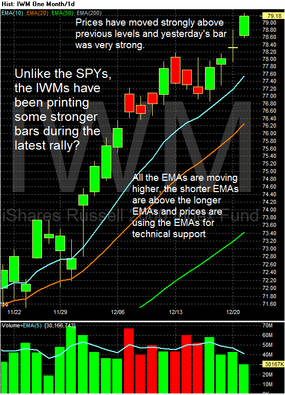
I'm going to try something different for the next few weeks. Instead of offering commentary on the charts below them, I'm going to do all the commentary on the charts themselves. So, click on all the charts for a larger image and then let the annotations do the talking. Please feel free to comment whether you like this or not.


Monday, December 20, 2010

Household Deleveraging Continues

- by New Deal democrat

The Federal Reserve's report on household debt burdens was released Friday, covering the July-September quarter. According to the bank,
The household debt service ratio (DSR) is an estimate of the ratio of debt payments to disposable personal income. Debt payments consist of the estimated required payments on outstanding mortgage and consumer debt.

The financial obligations ratio (FOR) adds automobile lease payments, rental payments on tenant-occupied property, homeowners' insurance, and property tax payments to the debt service ratio.
Both measures declined substantially again, although by not as much as the last few quarters. I've combined them into a single graph:


Debt service payments (blue line) are now less than most of the last 30 years. Total financial obligations (red line), are now less than all but the early 1980s and 1990s - i.e., less than more than 2/3's of the last thirty years.

If this rate of decline continues, then by 6 months from now, households will have lower debt burdens than at any time since the early 1980s - in other words, they will be at a 25 year low.

Recently, a few pundits have made the argument that households weren't actually cutting their debt at all, based on bank charge-offs and foreclosures.

This was addressed and appears to have been put to rest by the New York Federal Reserve. The bank's Quarterly Report on Debt and Credit for the third quarter of 2010 showed that
Since its peak in the third quarter of 2008, nearly $1 trillion has been shaved from outstanding consumer debts.

Additionally, this quarter’s supplemental report addresses for the first time the question of how this decline has been achieved and notes a sharp reversal in household cash flow from debt, indicating a decrease in available funds for consumption. According to newly available data through year end 2009, the payoff of debt by consumers reduced their cash flow by about $150 billion, whereas between 2000 and 2007, borrowing had contributed more than
$300 billion annually to consumers’ cash flow.

Excluding the effects of defaults and charge-offs, available data show that non-mortgage debt fell for the first time since at least 2000. Also, net mortgage debt paydowns, which began in 2008, reached nearly $140 billion by year end 2009. These unique findings suggest that consumers have been actively reducing their debts, and not just by defaulting.

“Consumer debt is declining but only part of the reduction is attributable to defaults and charge-offs,” said Donghoon Lee, senior economist in the Research and Statistics Group at the New York Fed. “Americans are borrowing less and paying off more debt than in the recent past.
The seemingly conflicting data on the relatively modest decline of overall debt, vs. the steep decline in financial obligations, is explained in large part by refinancing. Here is a graph, courtesy of Mortgage News Daily, of the volume of refinancing measured weekly in the past 2 1/2 years:


There was a surge of refinancing as mortgage rates fell to 4%. Somebody who, for example, had a 6% mortgage, and refinanced at 4%, instantly lowered their mortgage payment by 1/3 - even though the overall debt remained the same. Furthermore, it appears that about 1/3 of all mortgage refinancings during the third quarter included additional paydowns of mortgage balances as well.

When people wonder how we can have both increased saving, and increased spending, this is the answer.

Back to the Future: A Comparative Look at Two Recoveries Part I

A while back I wrote a diary comparing and contrasting the recovery from the 1981 recession to ours and highlighted some of the economic reasons why we were able to have such a strong recovery back then and why we lacked similar compelling reasons for a strong recovery today. Since that diary was published, our current recovery has continued (and may even be accelerating) and it now looks to be the strongest recovery since the end of the 1981 recession (except for the continued weak job creation numbers). This diary will attempt to highlight the strength of our current recovery with the recovery from the 1981 recession at a similar point removed from the trough and will again point out some of the deficiencies in job creation and growth catalysts between our recovery and the recovery from the 1981 recession. I have divided the diary into several posts, with this first one taking a look at employment.

First, let's get employment out of the way. Payroll growth has frankly stunk so far in this recovery and we can get a good look at how bad it has stunk when we compare it to the recovery from the 1982 recession (also keep this graph in mind as you read the rest of the post).

emp 82 v 09 indexed

But why are we lagging, well productivity isn't helping us out this time (ie the gains in productivity are greatly offsetting demand for more labor):

nonfarmoutput

And we need significantly fewer jobs per retail dollar (not a direct comparison with the 80's, but the trend is very evident):

retaildollarperjob

Plus, our productivity gains in manufacturing show that it takes far fewer jobs per point of industrial production that it did back in the 80s (although the trend there was down as well):

manjobsperindpro

In other words, we simply need less labor input for a greater level of production than we have in the past and this productivity growth is increasing at a rate that is greater than the growth rate in demand required to actually create new jobs (or at least at a rate that is not fast enough to absorb the losses from the recent recession at a pace that is desirous). The question we must ask is at what point do these productivity gains slow down enough to allow for significant job creation or have we reached a point where the productivity gains will continue to grow at a point that retards job growth a limits our ability to have a robust jobs recovery.


Year End Look At the Treasury Market


The primary trend for the IEFS has been a strong, upward sloping pattern over the last three years. However, notice that prices are currently nearing this important trend line. The real question is will the line hold? If not, then a fundamental trend that has lasted three years will be over, indicating an important shift in the bond market.


This year there were three important trends. The first was the rally that started in late May, caused by the EU crisis. This rally lasted until September, when prices formed a triangle top. Prices have since fallen hard and fast. Note the increasing volume on the sell-off.


Notice that when the IEFs were forming a second top, the MACD was decreasing (a), indicating the momentum was declining, indicating the rally was weaker. The MACD has continued to decline, indicating momentum continues to decline. This has been followed by a declining A/D line and negative CMF, both of what tell us that money is leaving the market.

New Jobless Claims and the Unemployment Rate continued (I)

- by New Deal democrat

On Friday I noted that adjusting first time jobless claims by population gives you the "initial jobless claims rate," which has tracked very closely over the last half century with the unemployment rate, with very few exceptions - one of which is now.

Surprising relationships like this are powerful motivation to the data nerd in me, so over the weekend (while I wasn't going to holiday parties), I took a further look. This is the first follow up post on what I found.

The following graphs come from a terrific site called Thumbcharts. The title of the graph is "Jobless Claims lead the Unemployment Rate." The methodology is explained as follows:
This chart shows the annual rate of change for initial jobless claims and the unemployment rate. Each series is modified with a six-month moving average and is compared using standard deviation.
In other words, as of now we are comparing the average of initial jobless claims from June 11 through December 11 of this year, with the same six month period last year. Similarly, the average unemployment rate from May through November of this year is being compared with the same average from last year.

Here is the resultant graph:


The graph is interactive, so it allows you to zoom in on particular periods. So I chose those where the unemployment rate did not decline as much as the change in initial jobless claims. The software also displays the actual data for one month when you place your cursor over that month, but it doesn't reproduce, so I am noting it in my comments to each graph.

But here is the summary: in every case except for the 1980-1982 "double dip," a decline of 10% as measured of initial jobless claims was followed within 10 months by a similar decline in the unemployment rate. Increase that to a 20% decline in the measure of initial jobless claims, and the period shrinks to 8 months.

Here is the 1980-1982 "double dip" recession period:


Initial Jobless claims were down 10%+ YoY by May 1981. The YoY low in the change in the unemployment rate (i.e., a percentage change in a percent) was -1.2% in September 1981.

Here is the 1991 recession and "jobless recovery" thereafter:


Initial Jobless claims were down 10%+ YoY by January 1993. They were down 20%+ by April 1993. The Unemployment Rate was down 10%+ in November 1993 -- 11 months later.

Here is the 2001 recession and "jobless recovery" thereafter:


Initial Jobless claims were down 10%+ YoY by March 2004. The Unemployment Rate was down 10%+ in September 2004 -- 6 months later.

And here is the Great Recession and current recovery:


Initial Jobless claims have been down 10%+ by March 2010, and 20%+ since April. The Unemployment Rate is only down -1.5% in November 2010. As with the metric I posted Friday, presently this is by far the weakest decline in the unemployment rate compared with initial jobless claims in the entire series.

The two data series' past relationship argues that if initial jobless claims continue to drift lower to 400,000 over the next 6-8 months, by that time unemployment is likely to be under 9%. To repeat the 1980-82 scenario, there would have to be a shock (like a large further increase in the price of Oil, or another Euro crisis, or similar), sending initial claims higher, in order to negative the decline in the employment rate.

------
P.S. SilverOz asked me to look into initial claims are a percentage of the labor force. I have done so, and here is the comparison between that (green) and initial claims are a percentage of population (blue) (I multiplied this by two so it would be easier to compare):


As you can see, they are virtually identical since 1980. This reflects the gradual entry of women into the workforce.

In this graph I add in the unemployment rate (red):


The relationship tracks more closely via my original metric.

The data series start in the 1960's, so unfortunately I cannot take the comparison back further.

I have much more to say about this, hopefully tomorrow.

Share

Twitter Delicious Facebook Digg Stumbleupon Favorites More