logo

Tuesday, September 28, 2010

Household debt payments continue to decline

- by New Deal democrat

Two of my favorite topical statistics were released Monday by the Federal Reserve Bank. They are the Household Debt Service Ratio and the Financial Obligations Ratio. Together, these data series show that households continue to trim their debt payments as of the most recent reporting period. Their only failing is that they are released quarterly, and three months after the end of the quarter, so that the data released yesterday covers the period from April to June this year.

Here is how the Federal Reserve defines each statistic, and where they stand as of midyear:
The household debt service ratio (DSR) is an estimate of the ratio of debt payments to disposable personal income. Debt payments consist of the estimated required payments on outstanding mortgage and consumer debt.


This ratio has been declining by .25% a quarter for over a year, and continued declined again by .28% during the April - June quarter. There is every reason to believe that this ratio now is already about 11.88%.
The financial obligations ratio (FOR) adds automobile lease payments, rental payments on tenant-occupied property, homeowners' insurance, and property tax payments to the debt service ratio.


This ratio has been declining by .30% per quarter for over a year, and as of last quarter was 17.02%. There is also every reason to believe that the ratio has declined by about another .30% this quarter to 16.68%, but we won't find that out until the end of the year.

Household debt burdens on average have already declined to the point where they are in less than what they have been in all but about 10 of the last 30 years. At the current rate of decline, household debt burdens will be at an all time low for the series by the end of next year.

This data does not conflict with the recent hubbub in the blogosphere that households have not deleveraged in terms of the total amount of debt owed, as shown in this graph, also from the Federal Reserve, in its most recent flow of funds report:


Taken together, what the above three graphs show is that the total amount of outstanding household debt has not declined that much, but the rate of household income devoted to payment of that debt continues to decline.

The reason for this is shown most graphically in the mortgage bankers association's refinance index. Here is where it stood a couple of weeks ago:

Notice that as mortgage payments approached 4%, a flurry of refinancing occurred both last year and again recently.

In other words, if I refinance a $200,000 mortgage from 6% to 4%, the total amount of my debt hasn't gone down, but the amount I have to pay monthly on that debt has gone down dramatically.

In addition to mortgage refinancing, some deleveraging is being done involuntarily by way of mortgage foreclosures and also by cutbacks in credit card availability.

Also, while the purchases of new cars continue at a 25% reduction from the 16 million annual rate of a few years ago, according to Edmunds.com
said that used car prices nationwide have increased 10 percent from 2009. The report estimated that the average price for a used three-year-old vehicle in July was $19,248, up about $1,800, or 10.3 percent, from July 2009.
Contrarily,
as of 2010 the average cost of a new car in the United States is somewhere around $28,400.
Thus, as an increasing number of people finance used rather than new cars, or elect to keep driving their car after the time when their car loan is paid off, auto loan debt is declining.

This is of a piece with the increase in the rate of personal savings:


Refinancing and the decline in household debt service obligations show how we have been able to have a modest increase in consumer spending by way of real retail sales and real personal consumption expenditure increases, while still increasing personal savings.
Ohh Lah! Lah!


France's ex-justice minister Rachida Dati MEP mixed up the words "fellatio" and "inflation" - which sound similar in French - during a TV interview.

Monday, September 27, 2010

Yesterday's Market


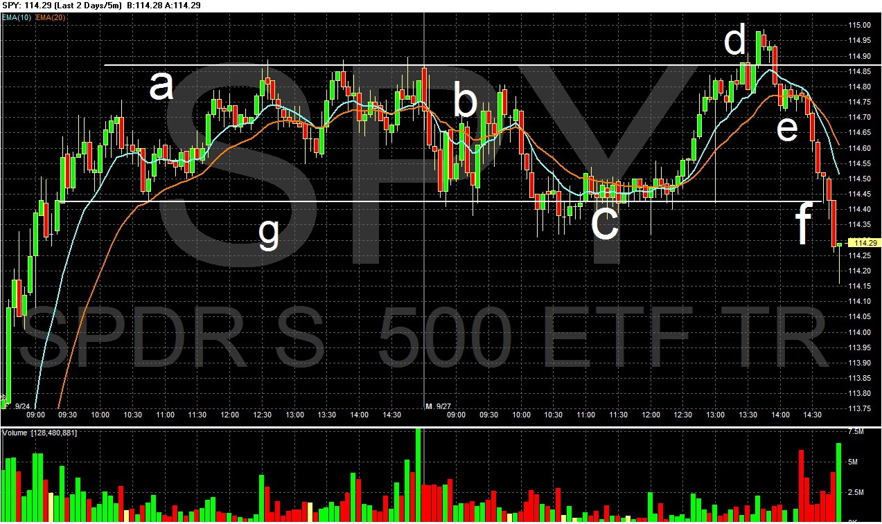
Yesterday, prices really didn't move much at after the open (b). However, in mid-morning they fell to lows from Friday (c and g), then attempted to rally past resistance and failed (d and a). Prices then fell to the 20 minute EMA (e) and then fell off further into the close on high volume (f).


The IWCS -- the microcap index--are just above key resistance levels. Also note the EMA picture is improving with all of the shorter EMAs (10, 20 and 50 day) rising. However, the EMAs have been floating around the 200 day EMA for some the last month or so, so this is not as important a technical development, yet Take a close look at the A/D and CMF lines -- notice neither dipped lower during the sell-off. This indicates a lot of money did not leave the market; instead, more or less the same same number of traders were involved. Finally, note the MACD is rising, indicating momentum is strong.


The Transports are also right at key resistance levels (a). However -- and like the IWCS -- the A/D line and CMF indicate the recent sell-off did not cause a bid exodus from the market; instead, traders bode their time. Also note the MACD is rising.


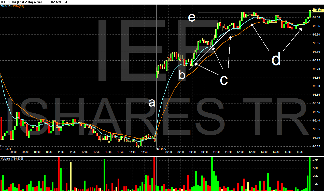
In contrast we have the Treasury market, which opened with a gap higher (a) and them moved into a rally throughout the morning (b). Along the way prices consolidated in downward sloping pennant patterns (c). Prices spent most of the rest of the day consolidating in sideways movement (d), but did rally above resistance right at the close on increasing volume.

Oil dropped right at the open (A), rallied into the 50 minute EMA (B) and then fell again, forming a double bottom (C). Prices then rallied again (D), sold off and rallied again (E), eventually closing lower.


Gold is in a strong, upward sloping trend bound by lines A and B. The EMA picture is incredibly strong with all moving higher and the shorter above the longer (C). Also note that momentum is positive (D).

Where is the S&P 500 ?


I belong to Stocktwits which has some really good traders posting. Here is a chart of the S&P 500 that I hadn't caught:

A Closer Look at Wheat

Sometime over the last few years I read a series of market analysis books that dealt with inter-market analysis and cyclical analysis. These books look at markets from a relationship perspective. For example, because most commodities are priced in dollars, the dollar and commodities usually have an inverse relationship: when the dollar rises commodities priced in dollars fall. Another example is the recent inter-relationship between the stock and bond markets; as the bond market has rallied it has taken money from the stock market.

Inter-market analysis stresses the importance of four markets: equities, capital markets (the bond markets) futures (commodities) and currencies. This week, I'm going to take an in-depth look at some of the commodity markets, providing some basic information on the big commodities.

From the USDA:

The United States is a major wheat-producing country, with output typically exceeded only by China, the European Union, and India. During the 2000s, wheat ranked third among U.S. field crops in both planted acreage and gross farm receipts, behind corn and soybeans.

.....

The five major classes of U.S. wheat are hard red winter, hard red spring, soft red winter, white, and durum. Each class has a somewhat different end use and production tends to be region-specific.

  • Hard red winter (HRW) wheat accounts for about 40 percent of total production and is grown primarily in the Great Plains (Texas north through Montana). HRW is principally used to make bread flour.
  • Hard red spring (HRS) wheat accounts for about 25 percent of production and is grown primarily in the Northern Plains (North Dakota, Montana, Minnesota, and South Dakota). HRS wheat is valued for high protein levels, which make it suitable for specialty breads and blending with lower protein wheat.
  • Soft red winter (SRW) wheat, accounting for 15-20 percent of total production, is grown primarily in States along the Mississippi River and in the Eastern States. Flour produced from milling SRW is used in the United States for cakes, cookies, and crackers.
  • White wheat, accounting for 10-15 percent of total production, is grown in Washington, Oregon, Idaho, Michigan, and New York, and its flour is used for noodle products, crackers, cereals, and white-crusted breads.
  • Durum wheat, accounting for 3-5 percent of total production, is grown primarily in North Dakota and Montana and is used in the production of pasta.
.....

Wheat area has dropped from its early 1980s highs, due mostly to declining returns relative to other crops and alternative options under government programs. Authorization of the Conservation Reserve Program (CRP) in the 1985 Farm Act, followed by planting flexibility provisions in the 1990 Farm Act, provided wheat farmers with other options for use of their acreage. Under the 1990 Act, farmers participating in commodity programs could plant up to 25 percent of their base wheat acreage to crops other than wheat without losing base acreage. Farmers thus had an incentive to grow crops promising higher returns or to earn rental payments from idling land under the CRP.

Let's take a look at some charts regrading wheat exporters and importers:


The US' percentage of world exports has been pretty consistent over the last 20 years.


The US has consistently been one of the largest wheat exporters.


Total wheat imports have been increasing for the last 30 years, led by


Increased demand from North Africa and the Middle East

Let's take a look at wheat prices from several perspectives, starting with the long-term and moving to the short-term.

For the first part of the decade, wheat prices were confined to a fairly narrow trading range (A). However, prices spiked in a big way in 2008, but have fallen a bit from those levels (B). Currently, prices are rising again, largely on news from Russia.


Section (A) highlights the 2008 price spike clearly. Prices have consolidated by forming a strong basing pattern (B) for about a year and a half.


The daily chart shows the Russian price spike (A) and the recent consolidation from high levels (B). Notice that despite decreased momentum (C), prices are moving sideways and are above the 50 day EMA. This tells us that traders aren't selling their positions outright, but are taking some profits off the table and are waiting to see what happens.

The Folly Of Ratings Agencies

From the NY Times:

As the mortgage market grew frothy in 2006 — leading to a housing bubble that nearly brought down the banking system two years later — ratings agencies charged with assessing risk in mortgage pools dismissed conclusive evidence that many of the loans were dubious, according to testimony given last week to the Financial Crisis Inquiry Commission.

.....

The commission, a bipartisan Congressional panel, has been holding hearings on the origins of the financial crisis. D. Keith Johnson, a former president of Clayton Holdings, a company that analyzed mortgage pools for the Wall Street firms that sold them, told the commission on Thursday that almost half the mortgages Clayton sampled from the beginning of 2006 through June 2007 failed to meet crucial quality benchmarks that banks had promised to investors.

Yet, Clayton found, Wall Street was placing many of the troubled loans into bundles known as mortgage securities.

Mr. Johnson said he took this data to officials at Standard & Poor’s, Fitch Ratings and to the executive team at Moody’s Investors Service.

“We went to the ratings agencies and said, ‘Wouldn’t this information be great for you to have as you assign tranche levels of risk?’ ” Mr. Johnson testified last week. But none of the agencies took him up on his offer, he said, indicating that it was against their business interests to be too critical of Wall Street.

“If any one of them would have adopted it,” he testified, “they would have lost market share.”

The financial crisis has pretty much proved the ratings agencies are useless when it comes to, well, rating securities. While some provide other, valuable services (such as the S and P 500), the whole "single A" or whatever rating on anything is worth nothing.

Wolseley To Leave The UK

Wolseley the world's largest plumbing, heating and building materials supplier, will leave the UK and relocate to Switzerland, where it regards the tax regime to be less "uncertain".

Corporate tax rates in Switzerland are regarded as being more "competitive" than the UK.

Wolseley expects its underlying tax rate to come down from 34% to 28%.

American Housing Survey

The Census Bureau releases the American Housing Survey every two years. This particular survey is important in that it encompasses the drop in real estate prices....

Here are some interesting facts....

There are 76.428 million owner occupied units...50.300 million have a mortgage...24.206 million own their home free and clear.....10.962 million have a mortgage of under $50,000....

so 46% of home owners own their home outright or have a mortgage of less than $50,000...

24.066 million had a mortgage of 6% or more in 2009( I am sure this is much less with all

the refinancings in 2010)....5.804 million have a mortgage and are over 65 ( the median mortgage for this group is $55,911 and the loan to value is 35%)

Here is the link....


http://www.census.gov/hhes/www/housing/ahs/ahs09/ahs09.html

Yesterday's Market


The SPYs have moved through important areas of resistance (a).


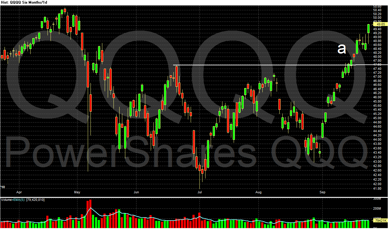
The QQQQs are above important areas of resistance (a).


The DIAs are above resistance (a).


The IWMs are just below important areas of resistance (a).


The IWCs have moved through important resistance.


The IYTs are just below important areas of resistance.

Anyone notice a pattern to the above observations? Equities are advancing; and it's not just one average. All are either through resistance or just below. This is a very bullish development as it indicates that across a wide range of investors classes (conservative, large cap buyers, technology and small cap investors), we're seeing interest in equities.

In addition, consider these charts of the long-end of the Treasury Market:


The IEFs broke through support, rallied to support and then moved lower again. In addition,


The long-end of the Treasury market is right below technical support.

In other words, prices in the Treasury market -- which has pulled support from the equity markets -- are moving lower at the same time we're seeing money move into equities.


The dollar has been dropping for about a month. After hitting point (b), it has formed upward sloping consolidation patterns (c, d, and e). Last week it tumbled after the Fed announced it wouldn't be rising rates anytime soon. With a falling dollar, remember that commodities will have an upward bias.


Above is a chart of lumber, which was in a strong basing pattern (A) for a few months. Now prices have started to move higher, with the initial break occurring at (B) and a continuing at (C). Lumber is obviously a key component of the housing market, so we could be seeing come initial buying in anticipation of a housing rebound.

Sunday, September 26, 2010

A Closer Look At Corn


From the USDA:

The major feed grains are corn, sorghum, barley, and oats. Corn is the primary feed grain in the United States, accounting for more than 90 percent of total feed grain production and use.

.....

Corn acreage in the United States has increased from a government-mandated low of 60.2 million planted acres in 1983 due to provisions in the Federal Agriculture Improvement and Reform Act of 1996. The Act permitted farmers to make their own crop planting decisions based on the most profitable crop for a given year. While the number of feed grain farms (those that produce corn, sorghum, barley, and/or oats) in the United States has declined in recent years, the acreage per corn farm has risen. Moreover, the number of large corn farms (those with more than 500 acres) has increased over time, while the number of small corn farms (those with less than 500 acres) has fallen.

.....

Corn production has risen over time, as higher yields followed improvements in technology (seed varieties, fertilizers, pesticides, and machinery) and in production practices (reduced tillage, irrigation, crop rotations, and pest management systems).

.....

Strong demand for ethanol production has resulted in higher corn prices and has provided incentives to increase corn acreage. In many cases, farmers have increased corn acreage by adjusting crop rotations between corn and soybeans, which has caused soybean plantings to decrease. Other sources of land for increased corn plantings include cropland used as pasture, reduced fallow, acreage returning to production from expiring Conservation Reserve Program contracts, and shifts from other crops, such as cotton.


In other words, corn is a raw material that is processed in various ways into other goods which are then sold in some form.

Let's take a look at some data:


Corn is obviously the dominant component in feed grains.


Notice the continued increased in yield, indicating farming is becoming much more efficient.


Also note that demand and supply continue to increase.


Ethanol use is clearly one of the primary drivers for increased corn use over the last few years.

Corn is very important to agricultural exports:

The United States is the world's largest producer and exporter of corn. Corn grain exports represent a significant source of demand for U.S. producers and make the largest net contribution to the U.S. agricultural trade balance of all the agricultural commodities, indicating the importance of corn exports to the U.S. economy. On average, corn grain (excluding popcorn or sweet corn) accounted for approximately 11 percent of all U.S. agricultural exports by value during the 1990s. In 2008, due to record exports of corn and other feed grains, that share grew to over 12 percent of the U.S agricultural export value.

Here are the relevant charts regarding exports and imports:


The US is obviously the largest corn exporter by far


Notice the developing countries have continually increased their corn imports for the last 20 years. The Middle East is also a strong source of growing demand.


Let's take a look at the charts:


For the first part of the decade, corn prices were fairly subdued with the exception of an early 2004 price spike (A). Like all commodities, corn rallied in a big way in 2008, but fell with the recession (B). It consolidated in a triangle pattern (C), but has since rallied (D) in concert with wheat.


The weekly chart shows the 2008 spike (A) along with the triangle price consolidation (B) and the recent rally (C).


Prices have been in a strong uptrend since the beginning of June with two uptrends (A and B) ini place. Prices have consolidated gains during the rally in a standard downward sloping pennant pattern (C). Prices have recently topped (D) and printed three strong downward sloping bars this week. The EMA picture is still bullish (E), but the MACD has given a sell-signal (F).

Share

Twitter Delicious Facebook Digg Stumbleupon Favorites More