logo

Friday, September 3, 2010

The Employment Report, Part 1

From the BLS:

Nonfarm payroll employment changed little (-54,000) in August, and the unemployment rate was about unchanged at 9.6 percent, the U.S. Bureau of LaborStatistics reported today. Government employment fell, as 114,000 temporaryworkers hired for the decennial census completed their work. Private-sector payroll employment continued to trend up modestly (+67,000)


Let's start with the household survey.

The civilian, non-institutional population increased by 209,000. This is the denominator of several important macro statistics.

The civilian labor force increased 550,0000, for an increase in the labor force participation rate of .1%, increasing from 64.6% to 64.7%.

The number of unemployed increased 261,000, leading to an increase in the unemployment rate of .1%, increasing the level from 9.5% to 9.6%.

The number of employed increased by 290,000, for an increase of the employment to population ration of .1% or a rise from 58.4% to 58.5%.

The increase in the labor force tells us the more people moved back into the labor force. There are far too many reasons for this to ascribe a good or bad label to it.

It is important to remember that with the workforce getting older, we will start to see a decrease in the employment to population ratio and the labor force participation rate.

Let's move onto the establishment survey.

Total private hiring increased 61,000, 107,000 and 67,000 over the last three months. This is not an inspiring series of numbers and indicates that employers are extremely cautious about something.

Goods producing job gains stood at 0 as increases in mining and construction were offset by decreases in manufacturing. The decreases in manufacturing are consistent with the lower numbers we have been seeing in various regional manufacturing surveys over the last few months.

The service sector was responsible for all of the gains in the work force, accounting for 67,000 jobs. The bulk of these jobs came in the professional service category (+20,000) and education and health care services (+45,000). This number has printed at 60,000 and 70,000 for the preceding two months -- again, a very uninspiring series of numbers.

Government employees are responsible for the bulk of all the job losses for the last three months, as this category of employment has decreased by 236,000, 161,000 and 121,000 for the last three months, respectively.

On a scale of 1-10, I'd give this about 3.5. The private sector is hiring, but just barely. Manufacturing -- which led us out of the recovery -- is slowing and the service sector is having difficulty picking up the slack.
Yesterday's Market


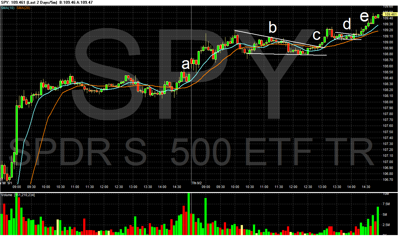
Yesterday, prices gapped slightly higher at the open (a), and rode the EMAs a bit higher before consolidating gains in a downward sloping triangle (b). After breaking out of the triangle (c), prices rose again before consolidating again (d), and then rising into the close on increasing volume (e). This is the second day in a row that prices have closed near their daily highs.


Prices have moved through the 10, 20 and 50 day EMA, and are now right below the 200 day EMA.


Treasuries are right at critical support. A close below this level with downside follow-through would be very bullish for the stock market.


Yesterday prices gapped lower at the open (a) moved lower but with the MACD moving sideways a reversal shouldn't have been a surprise. Prices bottomed, rose a bit but in reality traded in a very tight range for the rest of the day.

Both the equity and bond markets are waiting for tomorrow's employment report. Both stand at important technical levels, ready to make important moves in either direction.


Oil had a strong rally yesterday (A). There were three strong advances (C) followed by areas of consolidation (B).


Gold continues its upward advance (A). Notice the bullish orientation of the EMAs (B) with the shorter above the longer and all moving higher. In addition, the MACD is still bullish (C). However, prices are nearing key areas of resistance (D).

Thursday, September 2, 2010

Quarterly Banking Profile, Part II

Let's turn our attention to loan quality:
Insured institutions added $40.3 billion in provisions to their loan-loss allowances in the second quarter. While still high by historic standards, this is the smallest total since the industry set aside $37.2 billion in first quarter 2008 and is $27.1 billion (40.2 percent) less than the industry’s provisions in second quarter 2009. Fewer than half of all institutions (41.3 percent) reported year-over-year reductions in quarterly loss provisions. Only 40 percent of community banks (institutions with less than $1 billion in assets) reported year-over-year declines. Reductions were more prevalent among larger institutions. More than half (56.2 percent) of institutions with assets greater than $1 billion had lower provisions in the second quarter.


The FDIC divides banks according to asset size, focusing on the lines between above and below $1 billion. Notice that over 50% of largest institutions had lowered loan-loss reserves. This is a good development as the US banking system is fairly concentrated. However, only 40% of smaller banks reported a drop in the loan-loss reserve, indicating this part of the industry is still under pressure.

Net charge-offs totaled $49 billion in the second quarter, a $214-million (0.4 percent) decline from a year earlier and the first year-over-year decline since fourth quarter 2006. Charge-offs were lower than a year ago in most major loan categories except for credit cards and real estate loans secured by nonfarm nonresidential properties. Charge-offs on loans to commercial and industrial (C&I) borrowers were $3.1 billion (37.0 percent) lower than a year ago, while charge-offs on real estate construction and development (C&D) loans were $2.7 billion (34.6 percent) lower. Charge-offs of one-to-four family residential mortgage loans were down by $1.4 billion (16.0 percent). Credit card charge-offs were $8.6 billion (86 percent) higher than in second quarter 2009. Most, if not all, of this increase was attributable to the inclusion of charge-offs on securitized credit card balances, which were not included in reported charge-offs in previous years. The change in reporting was the result of the application of FASB 166 and 167. In contrast, the $1.8 billion (107.2 percent) year-over-year increase in charge-offs of nonfarm nonresidential real estate loans reflected further deterioration in commercial real estate portfolios. Almost half (49.1 percent) of insured institutions with more than $1 billion in assets reported lower net charge-offs, while only 43.6 percent of community banks reported year-over-year declines.


The decline in charge-offs is also extremely good news, as is the breadth of the lowered charge-offs. This indicates improvement in the general loan picture.

The amount of loans and leases that were noncurrent (90 days or more past due or in nonaccrual status) declined by $19.6 billion (4.8 percent) during the second quarter. This is the first quarterly decline in noncurrent loans since first quarter 2006. Noncurrent levels declined in most major loan categories during the quarter. The sole exception was nonfarm nonresidential real estate loans, where noncurrents increased by $547 million (1.2 percent), the smallest quarterly increase in three years. The largest reduction in noncurrent loans in the quarter occurred in real estate C&D loans, where noncurrents fell by $5.9 billion (8.3 percent). This is the third consecutive quarter that noncurrent C&D loans have declined. Noncurrent C&I loans also declined for a third straight quarter, falling by $2.7 billion (7.3 percent), while noncurrent residential mortgage loans declined by $4.7 billion (2.5 percent) and noncurrent credit cards fell by $4.2 billion (19 percent). Slightly fewer than half of all institutions (48.9 percent) reported declines in their noncurrent loan balances during the quarter. Noncurrent loan balances fell by 5.3 percent at institutions with more than $1 billion in assets and rose by 0.3 percent at community banks.


This
decline in non-current loans -- both its occurrence and the breadth of its occurrence -- is very good news. It is important to caution this is the first decline we're seen in a few years, so some caution going forward is warranted (one quarter does not make a trend).
Total loan-loss reserves of insured institutions fell for the first time since fourth quarter 2006, declining by $11.8 billion (4.5 percent), as net charge-offs of $49 billion exceeded loss provisions of $40.3 billion. Almost two out of three institutions (61.7 percent) increased their loss reserves in the second quarter, but a number of large banks reduced their loss provisions, producing net declines in their reserve balances. In particular, some institutions that converted equity capital into reserves in the first quarter in accordance with the requirements of FASB 166 and 167 reported lower provisioning in the second quarter. Although the industry’s ratio of reserves to total loans fell from 3.50 percent to 3.40 percent during the quarter, it is still the second-highest level for this ratio in the 63 years for which data are available. The industry’s “coverage ratio” of reserves to noncurrent loans improved for a second consecutive quarter, from 64.9 percent to 65.1 percent, as the reduction in noncurrent loans slightly outpaced the decline in loss reserves.


Again -- these are are healthy developments.

Here are the relevant charts:

Notice the pace of quarterly charge-offs appears to be topping -- we've seen more or less the same level for the last 5 quarters.


Charge - offs are higher than loan loss provisons


The drop -- so far -- is only one quarter of data coming from a very high level. While this is an encouraging development, we need a few more quarters of data before declaring victory.


Non-current rates on residential mortgages appear to be topping, although at high rates.


These levels are sky high.


The non-current rate for larger institutions is dropping, but was also at a higher rate than that for smaller institutions. Also note the rate for smaller institutions also appears to be toppin.


Quarterly Banking Profile, Part 1

The FDIC released the quarterly banking profile several days ago. Today I want to delve into this very important report and highlight important development in the industry. Let's start with earnings:
Reductions in loan-loss provisions underscored improvement in asset quality indicators during second quarter 2010. The industry’s quarterly earnings of $21.6 billion are up dramatically from the year-ago loss of $4.4 billion and represent the highest quarterly earnings since third quarter 2007. Almost two out of three institutions (65.5 percent) reported higher year-over-year quarterly net income. The proportion of institutions reporting quarterly net losses remained high at 20 percent but was down from more than 29 percent a year earlier.

Banks are setting aside less money for loan losses -- this is an extremely encouraging development, as it indicates that loan quality is either stabilizing or getting better (we'll get to this later today). The strong year over year comparisons are good and bad; they are good because there was a wide-spread increase, but bad because the YOY comparison is pretty easy to make. The breadth of the increases are a very good sign, although we're still seeing a large number of institutions with some pretty big losses.
Net interest income was $8.5 billion (8.6 percent) higher than a year ago, as more than 70 percent of all institutions reported year-over-year increases. Net interest margins at almost 60 percent of institutions (58.6 percent) improved from a year earlier, as average funding costs fell more rapidly than average asset yields. The magnitude of the increase in net interest income was largely attributable to the application of Financial Accounting Standards Board (FASB) Statements 166 and 167 in 2010 at a small number of institutions with significant levels of securitized consumer loans; among other things, the new rules require that revenues from securitized loan pools that had previously been included in noninterest income be reflected in net interest income.1

One of the primary way banks make money is on the "spread" -- the difference between short and long-term rates. Banks lend money to depositors at short-term rates and make money lon loans which are usually of a longer term. In addition, with the yield curve currently pretty steep, banks are investing short term assets into bonds and pocketing the difference. Either way, the difference between short and long-term assets is an important one for banks. Also note the increase was "largely attributable" to an accounting change that forced banks to add a new asset to their interest bearing assets.

Here are some accompanying graphs.


At some point, Housing becomes a compelling bargain

- by New Deal democrat

Via Economist's View, here is commentary by Karl Case in the New York Times:
Four years ago, the monthly payment on a $300,000 house with 20 percent down and a mortgage rate of about 6.6 percent was $1,533. Today that $300,000 house would sell for $213,000 and a 30-year fixed-rate mortgage with 20 percent down would carry a rate of about 4.2 percent and a monthly payment of $833. In addition, the down payment would be $42,600 instead of $60,000....
[H]ousing has perhaps never been a better bargain, and sooner or later buyers will regain faith, inventories will shrink to reasonable levels, prices will rise and we’ll even start building again.
I suspect that as to sales, housing is bottoming right now (could we get lower sales figures during the winter, sure). As to prices, it probably has a couple more years to go on a nationwide basis, as the price to income ratio is still above its long-term norm.

But Case is right. In some local markets, most notably those that were the most infested bubbilicious areas of half a decade ago, housing is already almost a steal.

For example, take Phoenix AZ. According to Housing Tracker, in April 2006, the median asking price for a property in the Phoenix area was $333,800 (and that was after the peak). As of this week, it is $149,000. That's a 55% decline. A search this morning for a 1800+ square foot single family home built less than 20 years ago generated 100s of results, including this house:


the asking price for which is $75,000. A 20% down payment is $15,000. A 30 year mortgage at 4.2% requires a monthly payment of $293.41.

A young couple just starting out might have to borrow some from their parents or affluent Uncle Bob for help with the down payment for this house, but at under $300 a month, they are practically giving it away. Even if the price of this house were to fall another 20%, the couple still wouldn't be underwater, and would have a home of their own in the meantime. If they lived there for 10 years, there is an excellent chance they would break even or better.

Five years ago, that young couple - if they were financially responsible at all - would have been completely priced out by a mortgage that, at 6.6%, and increased proportionately to the April 2006 price level, would have run $1064.43 a month!

The housing bubble and ensuing bust has been a disaster. But there are plenty of people who were frugal and did not fall for the bubble. There are also millions of young people who were 18-25 years old at the height of the bubble and too young to participate, who are now 23-30 years old and if they have jobs, can easily afford housing in some of the formerly "hot" housing markets.

At some point, housing becomes a compelling bargain. As prices fall further nationwide, that will become the case in more and more areas and for more and more people. That is when the housing bust will end.

Yesterday's Market


Yesterday prices gapped higher at the open (a), hit the 10 minute EMA and moved higher (b) and then spent the rest of the day moving sideways in a tight range (c). Notice that prices didn't sell-off at the end of trading, indicating traders are willing to keep positions overnight.


Prices found resistance at highs from 8 days ago (a).


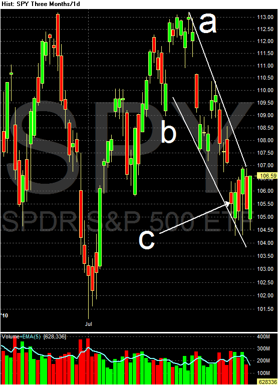
On the daily chart, prices broke out of the downward sloping wedge pattern and moved through the 10 and 20 day EMA. Also note prices printed a very strong bar on solid volume (a).


Treasuries were the mirror image of stocks. Prices gapped lower at the open (a), ran into resistance at the 10 minute EMA (b), bottomed (c) and then moved slightly higher.


However, the IEFs are still in a very strong uptrend (a), although prices are approaching important technical levels. For the last 4 months, the upward trend line in the Treasury market has acted as a natural selling point for stocks.

Copper had a strong break out, starting in the Asian markets (A). Prices moved through resistance (B), then consolidated their gains before the US open (C). Prices moved higher again, moving through resistance (D) and then consolidated again (E).


Copper consolidated gains in a downward sloping pennant pattern over a few weeks, but has broken out strongly printing some good bars (A). Note the EMAs are still bullish with the shorter above the longer and all moving higher (C). Finally, the MACD has given a buy signal (B).

Wednesday, September 1, 2010

Chicago PMI Drops, But Is Still Positive


From Bloomberg:

Chicago purchasers report solid but slower month-to-month growth in August. The Chicago purchasers' index came in at 56.7, down sizably from 62.3 in July but still well above breakeven 50. New orders rose in the month, at an index of 55.0 but down from July's 64.6 for the slowest reading of the year. In an offset, backlogs, at 56.2, show a very strong gain for the month. Inventories are a negative, down more than four points to 46.5 to signal month-to-month contraction. But given solid shipping activity, some of this draw likely reflects production needs. Other readings indicate solid activity including greater slowing in deliveries and steady a month-to-month increase for employment.

The thing to remember with diffusion indexes is that lower readings are not necessarily a disaster. The readings in this report are holding well above 50 to indicate continued growth underway for the Chicago economy. The data point to favorable though slowing readings for tomorrow's ISM report on the manufacturing sector and Friday's ISM report on the non-manufacturing sector.


Here is a link to the report:

Here is a chart of the salient data:


Click for a larger image

Notice that the production and new orders numbers dropped. Also note that are both above 50, indicating expansion.

The size of the drop could be important. The numbers were printing solidly about 60 for the last 5 months and yesterday they dropped almost 10 points to mid-50's readings. This is in line with the drops we have seen in several regional manufacturing reports over the last few months.

============

NDD here: I just wanted to add a couple of notes, not about the Chicago index, but rather the ISM manufacturing index, which was surprisingly strong.

Another strongly positive surprise was the employment index which came in at 60.0. Early this year, when we were getting stubbornly negative employment readings (subsequently revised to positive), I looked at trends in the ISM index and payrolls, concluding as follows:

My original "Leading Employment Index" relied on an ISM manufacturing reading above 53. We can tweak that in a manner consistent with both above graphs by insisting on the following as a prerequisite to job growth:

both [ISM manufacturing and non manufacturing] indexes be above 52 and average 53 or higher as a final signal, which gives one or two months' lead time to job growth.
ISM non manufacturing has been hovering near 54 in the last couple of months, and the ISM non manufacturing employment sub-index has been at or below 50. That report won't be released until after the BLS report. With ISM manufacturing strong, Challenger strong, and ADP weak, we have a picture very much like the end of last year.

As an aside, vendor deliveries also declined. This is one of the 10 LEI, and will detract about -0.1 from the LEI for August.

Bonddad here: nothing more to add, I just don't want NDD to have the last word

Bonddad Solves the Unemployment Situation

From the Financial Times:

“Nearly one in four construction workers is unemployed and nearly one in four bridges in the region are structurally deficient or functionally obsolete,” Mr Frye said.

“We have workers. We have work that needs to be done. What we’re missing is a commitment from Washington to invest in building our country, our state and our workforce.”

According to the BLS, the height of establishment jobs for the last expansion occurred in December of 2007 when there were 137,951,000 establishment jobs. According to the last jobs report, there were 130,242,000, bringing the total number of lost jobs to 7,709,000. Here is a chart of the data:


The construction industry has been hard hit by the recession -- which you would expect coming off of a housing bubble. Total construction employment reached its peak in August 2006 with a total of 7,725,000 construction jobs. The latest employment report showed this total to be 5,573,000 for a total loss of 2,152,000 or 27.91% of all job losses. Here is a chart of the data:

Manufacturing has also been hard-hit by this recession. I think you can guess where I'm going here, so I'll just eyeball the following chart of total manufacturing employment:

Let's call that 2.1 million jobs since roughly the end of 2007, or about 27% of all jobs lost.

So, blue collar jobs lost total over 50% of all job losses during the recession. So, why don't we allocate, say, $500 billion to infrastructure investment and get these people back to work? Make the projects long-term so infrastructure employment will last until private demand takes over in 3-5 years.

Was that so hard?

No need to thank me, Washington, just stop acting like jackasses.


The Savings Rate and Retail Spending

- by New Deal democrat

On Monday personal income, spending, and the savings rate for July were reported. Spending was up 0.4%, while the savings rate declined 0.3%.

Readers already know that for the last 5 years, households have been rebuilding their balance sheets. In April 2005, they saved a paltry 0.8% of earnings. That rocketed as high as 8.2% in May 2009. With the latest reading, personal savings was 5.9%. My position is that the "slow motion bust" won't be over until that balance sheet is fully rebuilt, with a savings rate closer to 10% as it stood in the 1970s and 1980s.

But, in the shorter term, we don't want the balance sheet rebuilt too quickly. When households cut back on spending - out of fear - in order to save, that is Keynes' Paradox of Thrift that throws the economy into a recession. A couple of weeks ago, in How Pavlov's Dogs explain the Sputtering Recovery I argued that it was exactly a case of paralyzing fear that put the economy into a sudden stall beginning at the end of April with the Euro crisis.

The tradeoff between savings and consumer spending is evident in the below graph. Since unfortunately the St. Louis FRED won't allow me to graph the rate of monthly change in the savings rate, the below is the best I can do. In the graph, the savings rate, normed to zero at its highest rate, is shown in blue. The change in retail sales, normed to zero at its lowest change, is shown in red, beginning of 2009.


While not exact, the general "mirror image" is clear. When the savings rate decreases (the blue line goes down), the change in retail spending increases (the red line goes up). When savings increase, the change in spending decreases. Note in particular the big increase in the savings rate in April of this year that coincided with a sharp decrease in the rate of retail spending. That was Pavlovian fear kicking in.

In tht regard, even if it is only one month, that consumers were comfortable saving a little less and spending a little more in July is a good sign that their Pavlovian fear may have begun to abate.

Yesterday's Market


Yesterday, the IEF's gapped higher at the open (a), fell a bit to the EMAs (b) and then gently rose for the rest of the day (c). However, most of their gain came from the opening gap higher.


For the last few days, the SPYs have found support in the (a) area. Yesterday, prices also found support and resistance between Fibonacci lines (b).


Prices gapped lower at the open (a), but quickly rebounded higher, printing strong bars (b) on decent volume. After hitting Fibonacci levels they got trapped in the EMAs for most of the day (c). They tried a near close sell off on rising volume (d) but quickly rebounded (e), finding resistance at Fibonacci levels.


On the daily chart, prices are still in a downward sloping wedge, between lines (a) and (b). Prices are also in a pretty tight range for the last week (c) at the bottom of the wedge.

Yesterday, oil prices took a big tumble, consolidating in a triangle pattern at the beginning of trading (A) and then falling for most of the rest of the day, rising to consolidate losses and find resistance at the EMAs several times (B and C). Prices eventually hit bottom at point (D).


Once again, oil prices are looking for support in the lower 70's area (A).


Wheat is still a correcting in a downward sloping pennant pattern (A). Notice that while momentum is decreasing (B), we're not seeing a price crash. The above chart pattern of a downward sloping consolidation pattern after a strong rally accompanied by decreasing momentum is pretty common.


Cattle has been in a strong rally (A) since the beginning of June. Prices are now approaching an important technical juncture as they decrease (C) gently to previous highs (B) and the upward sloping trend line (A).

Share

Twitter Delicious Facebook Digg Stumbleupon Favorites More