logo

Monday, August 30, 2010

Yesterday's Market


Prices dropped after gapping at the open (a) but rebounded pretty quickly (b). After rallying, prices fell back to key support levels (c) before again moving higher. Notice that prices used the 10 minute EMA as technical support. Finally, prices ended near highs for the day.


On the IEF, notice that prices were in a tight range for a 6 days (a). In addition, prices had three major drops last week (b, c and d). In short, prices couldn't hold onto gains.


On Friday, the IEFs opened with a gap at the open and rallied into the 10 minute EMA before making a strong downward move (c). Notice that prices rallied into the EMAs, but found resistance at those levels on a regular basis.


While the 7-10 year Treasury ETF is still in an uptrend (a) it dropped hard on Friday (b).

After consolidating (A), copper broke out on Friday (B). Note the MACD is close to giving a buy signal (C).


Oil has been an underperforming commodity for the last 4-6 months according to Stockcharts, PERF charts. Recently, prices hit key support areas (A) and bounced higher (D). However, the shorter EMAs are below the longer EMAs, but the MACD may be close to a buy signal (C).

Friday, August 27, 2010

Weekend Weimar And Beagle


It's that time of the week. Think and work on anything except the markets or the economy. Until Monday ...


Weekly Indicators: Horse Latitudes Edition

- by New Deal democrat

An initial note: at another, large blog, someone commented that "Krugman = lagging indicator." The person meant it sarcastically, but rephrased as "pundits = lagging indicator," it is true. It has been proven over and over again that pundit opinion as a whole follows trends. Which means that it misses turning points, which is why the KISS method of sticking with the LEI is more successful. As the economic data has deteriorated in the last few months, the range of generally accepted opinion has moved Gloomier and Doomier. It will continue to move that way until AFTER the next turning point.

More specifically, this weekend check out the Barron's website's data section, and see what insiders are doing, since individual investor sentiment is totally spooked by the "Hindenberg omen." Like the "Digby put" almost 2 months ago, it may actually be the "Hindenberg contrary omen." Insider buying vs. selling will tell us so.

This week the reduction of 2nd quarter GDP was made official. The economy is in the doldrums, nearly completely stalled. Durable goods orders, a leading indicator, tanked. New and existing home sales also declined, completing the collapse since the expiration of the $8000 tax credit.

One other item of interest, quite overlooked in the media, was the release of loan data for the second quarter by the Fed. Loans typically do not bottom until well after the bottom of a recession. They are badly lagging indicators, but they do confirm a turn. As it happens, a few of the series did actually turn up. Most all of the rest continued to decline, but at a much lower rate than they had up until this year. Too early to say they've turned, but they look like they are getting ready to turn.

Now here's my look at high frequency weekly indicators:

The Mortgage Bankers' Association reported that "the Refinance Index increased 5.7 percent from the previous week and is at its highest level since May 1, 2009. The seasonally adjusted Purchase Index increased 0.6 percent from one week earlier." The Purchase index continues to tell us that we have hit bottom, but without a significant bounce back yet. Refinancing tells us that household debt as a percentage of disposable income is going down, probably substantially. This is a good sign for the future.

The ICSC reported same store sales for the week ending August 21 rose 2.3% vs. a year earlier, and declined -0.4% from the prior week. Shoppertrak, on the other hand, reported that for the week ending August 21, YoY sales were up 4.5%, and down -0.4% vs. the prior week. The ICSC report concerns me, as this is the poorest YoY showing in several months, and the 4th straight week of WoW declines. Are consumers growing fearful again?

Gas prices decreased $.05 to $2.70 a gallon, at the low end of the range since May. At 9.373 million barrels consumed a day vs. 9.105 the same week last August, we continue to run ahead of last year, indicating expansion.

The BLS reported 473,000 new jobless claims, back in its 8 month range. We won't know if the increase we saw since early June has due primarily to state and local government and census layoffs until we see the jobs numbers a week from today.

Railfax continued to show renewed strong growth vs. last year in all 4 sectors: Cyclical, intermodal, baseline, and total traffic all continued to move sharply up, and intermodal traffic hit a new high! Auto carloads also continued to rebound strongly, although waste and scrap metal remained at last year's levels. In the last few weeks, I have written tht rail traffic has suggested that the double-dip was right now. Last week a reader asked in the comments
Question: when you say that the rail traffic suggests the double dip is right now, does that mean we are already on the way up out of it, given that traffic is turning back up after having been down?
Answer: yes it may be so. The bottom line is, indicators seem to behave differently in deflation vs. inflation, in that lead times become much more compact. Rail traffic has suggested that the downturn foreseen in the LEI beginning in April has already been happening. Rail traffic may now be telling us that the downturn in the private vs. public sector may be abating.

The American Staffing Association reported that for the week ending August 15, temporary and contract employment increased by 1.31%, pushing the index to a two year high of 95.0. This series is a leading indicator for jobs, and again suggests that the private sector is continuing to grow.

M1 declined -0.6% in the last week, but was up 1.0% month over month, and up 4.4% YoY, so “real M1” is up 3.1%. M2 increased less than 0.1% in the last week, and is up 0.3% month over month, and up 2.4% YoY, so “real M2” is up 1.1%. We have never had a recession without a negative real M1 reading, so this is encouraging, although the YoY trend remains down. Additionally, I would like to see real M2 up over 2.5% to feel confident that there will be no double-dip.

Weekly BAA commercial bond rates dropped .22% more last week to 5.56%, a decline of 0.76% in 9 weeks! This is simply totally inconsistent with the notion that another deflationary bust has started and creditworthiness is about to become an issue.

The Daily Treasury Statement as of August 25 (18 reporting days into the month) shows $116.4 B has been collected vs. $110.2 B a year ago, a gain of 5.6%. For the last 20 reporting days, we are up 5.8%, $125.0 B vs. $119.2 B. This is towards the low end of advances since the series turned positive YoY in March. This suggests to me that private sector employment is not continuing to improve relative to last year, although small positive growth may be taking place.

For the first time in awhile, almost all of the weekly indicators were positive, although their strength varied. Mortgage applications and rail traffic are particularly encouraging. The ICSC same store sales figure does concern me, however. Next week we'll get the jobs report, and what I will be particularly watching is whether weakness remains concentrated in the real estate/construction and government jobs area where stimulus programs expired, or whether the weakness is spreading out.

GDP Redux

After looking at the numbers, this report looks like a one-off. Consider the following points (please reference the posts below).

1.) PCEs are still increasing in line with the previous three quarters.
2.) PCEs of durable goods increased 6.9%.
3.) Service expenditures increased the most in a few years.
4.) Gross private domestic investment increased at a strong rate
5.) Equipment and software investment continues
6.) Residential investment was positive as well.

As I noted in the initial post on GDP, the real issue in the 2nd quarter was a huge increase in imports.

A Closer Look at GDP: Investment


Let's continue our look at today's GDP report with a closer look at domestic investment.

Total domestic investment is increasing at a solid rate.


Non-residential investment was just positive last quarter, although I wouldn't hold my breath about this number moving strongly higher in the near future.

Equipment and software investment increased at a strong pace, as did


Residential investment.

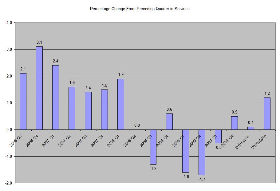
A Closer Look At GDP: PCEs


Let's take a deeper look into the data from today's report, starting with the largest percentage component of GDP, personal consumption expenditures or PCEs. You can click on all images for a larger image.


Total PCEs increased 2% from the preceding quarter, right in line with recent experience.


Services -- which comprise 65% of PCEs saw the largest increase since 2Q08.

Purchases of non-durable goods also increased, although at a lower rate than the previous quarter.

Durable goods purchases increase at a healthy pace.

Growth

As ever, figures provided by the ONS have had to be revised.

This time the figures for growth in Q2 2010 have been revised upwards, from 1.1% to 1.2%. This is the fastest quarterly growth in the UK since 1999. However, the economy had contracted by more than 6% before this.

A large part of this growth is made up of inventory building by companies, therefore it is presumed not necessarily to be sustainable.

Ed Balls, a Labour leadership candidate, used the revised figures to warn of an economic hurricane hitting the UK if the government cuts public expenditure.

The government, on the other hand, notes that the improved growth figures give them a sound base from which to cut excess public expenditure.

Doubtless both are right, but both will also be proven wrong.

Such is the nature of economics and politics!

GDP Revised Lower to 1.6%

From the BEA:

Real gross domestic product -- the output of goods and services produced by labor and property located in the United States -- increased at an annual rate of 1.6 percent in the second quarter of 2010, (that is, from the first quarter to the second quarter), according to the "second" estimate released by the Bureau of Economic Analysis. In the first quarter, real GDP increased 3.7 percent.

.....

The increase in real GDP in the second quarter primarily reflected positive contributions from nonresidential fixed investment, personal consumption expenditures, exports, federal government spending, private inventory investment, and residential fixed investment. Imports, which are a subtraction in the calculation of GDP, increased.

The deceleration in real GDP in the second quarter primarily reflected a sharp acceleration in imports and a sharp deceleration in private inventory investment that were partly offset by an upturn in residential fixed investment, an acceleration in nonresidential fixed investment, an upturn in state and local government spending, and an acceleration in federal government spending.


Let's take a look at the contributions to the percentage change:


The big issue is that imports subtracted 4.45 points from growth. Everything else is OK. From the preceding quarter, notice the PCEs increased 2%, gross private domestic investment increased 25%, exports were up 9% and government spending increased 4.3%. Imports increased a 32.4%, largely because of a 39.3% increase in imported goods. In other words, the real issue here is the increase in the trade deficit:


I'll touch on this for the rest of the day.

Yesterday's Market


After gapping higher at the open, prices broke the trend line started yesterday (a). They found support at previous lows (b) and tried breaking out but found resistance at the EMS (C). Even getting above the EMA couldn't give prices enough momentum, so they fell through support (e). When momentum shifter (f) prices rose but found resistance at the EMA (g), so they fell (f) on increasing volume.


The SPYs are currently at important support levels (a).


The IEFS (7-10 year treasury) are still in a rally (b). Notice the number of upward gaps the chart has printed recently (a).


After breaking through important resistance, the TLT has also printed several important upward gaps as well (a and b). Also notice how bullish the EMAs are -- the shorter are above the longer and all are rising (c).

Cattle is still in an uptrend (A), which has continued through important resistance levels (C) and consolidated gains along the way (B). After peaking, prices have fallen (d), but are still at elevated levels.


Copper is clearly consolidating recent gains (A).


Wheat is also consolidating gains (A).


Crude oil is currently at important support levels (A).

Thursday, August 26, 2010

A Look At the Value Line Average

Reader "R" asked the following question yesterday:

Have you noticed that Valueline Arithmetic is currently correcting from a high it made earlier this year? That recent peak was an all time high, and therefore was higher than the peak before the 2008-2009 crash. The Drawdown from this recent peak is approximately 15%. What do you make of this situation? Especially given that the S&P 500 has only recovered about 50% relative to its pre-crash high,while Valueline Arithmetic recovered over 100% and is now correcting. Would be very interested in what you have to say about this situation.


First, I had completely forgotten about Value line. For those of you who are unfamiliar, VL does some of the best fundamental research on the planet. They used to issue two huge binders, broken down by industry. Each industry section began with a general overview of the industry. Then the report would fundamentally break down each company within the industry and assign each company a ranking (which I think was 1 through 5). If I remember correctly, VL's top picks usually outperformed the market on a pretty regular basis. Anyway, this is a great source of information.

That being said, here is how Value Line explains their index:

On June 30, 1961, we introduced the Value Line Composite Index. This market benchmark assumes equally weighted positions in every stock covered in The Value Line Investment Survey. That is, it is assumed that an equal dollar amount is invested in each and every stock. The returns from doing so are averaged geometrically every day across all the stocks in The Survey and, consequently, this index is frequently referred to as the Value Line (Geometric) Average (VLG). The VLG was intended to provide a rough approximation of how the median stock in the Value Line universe performed.

On February 1, 1988, Value Line began publishing the Value Line (Arithmetic) Average (VLA) to fill a need that had been conveyed to us by subscribers and investors. Like the VLG, the VLA is equally weighted. The difference is the mathematical technique used to calculate the daily change.

The VLA provides an estimate of how an equal-dollar weighted portfolio of stocks will perform. Or, put another way, it tracks the performance of the average, rather than the median, stock in our universe. It can be shown mathematically, for all practical purposes, that the daily percentage price change of the VLA will always be higher than the VLG. The systematic understatement of returns of VLG is a major reason that the VLA was developed. Moreover, although the differences between daily price changes may seem small, the magnitude of the annual differential between the two averages can be very large. The greater the market volatility, the larger the spread between the geometric and arithmetic averages becomes.

In 1965, when the current Timeliness Ranking System began, our only market average was the VLG, so we scored the ranks on a geometric basis. This allowed us to compare the performance of the ranks versus the market (as measured by the VLG). After we started the VLA, we began scoring the ranks both on a geometric and arithmetic basis.


In other words, the VLA is an index of the average VL stock. That being said, here is the weekly chart:


Click for a larger image.

The reason this average has outperformed the SPYs is VL has a better selection of stocks. That shows they're pretty good at their job.

The index has printed two highs over the last few years -- A and B. Prices reached areas around previous highs and then started to move sideways. Notice how prices have risen and then turned into more of a sideways orientation (see curved line C). Since hitting previously established highs, prices have found support at line D and the 50 week EMA. Also note the index has declining momentum (F). Finally, take a good look at the EMAs (E). The shorter are above the longer, but the 10 and 20 week EMA are moving lower and the 10 is slowly working below the 20. This is a bearish development.

So -- what does this mean? All the equity averages -- even the VL -- is suffering from the concern over the US economy's overall direction right now. The recent spate of economic numbers indicate the economy is slowing which is bad for all equities.

However, the higher quality of the VL selection process is probably preventing an overall crash in this average.

Share

Twitter Delicious Facebook Digg Stumbleupon Favorites More