logo

Wednesday, May 5, 2010

ISM Employment and Nonfarm Payrolls April 2010

- by New Deal democrat

With this morning's release of the ISM Non manufacturing index, I wanted to update post I wrote a couple of months ago looking at the correlation between both the ISM Manufacturing and Non manufacturing indexes and nonfarm payrolls.

Last September when I was putting together a "Leading Index" exclusively for employment, I included the ISM Manufacturing index, which had always signaled growth in jobs whenever it crossed 53 (the iindex is a diffusion index, subtracting negative from positive responses, with neutral being at 50. Above 50 is expansion, below is contraction). Here is the graph I created at that time, with the trough in employment for each recession normed at 100, and the ISM Manufacturing index normed to cross that 100 jobs reading at 53:


The ISM's Non manfuacturing index, however, proved to be important in calculating when the jobs number actually turned from negative to positive in this Recovery, even though it is only 13 years old. So in March I refined the jobs leading indicator to include the following:

(1) the ISM manufacturing index be above 50 and ISM non manufacturing business activity above 48 as an initial signal; and
(2) both indexes be above 52 and average 53 or higher as a final signal, which gives one or two months' lead time to job growth. That signal was triggered for one month in October (accurately) and again for February.

With the ISM manufacturing index in April reading 60.4, and this morning's ISM non manufacturing index reading 55.4, the average at 57.9 is well into the job growth range.

[As an aside, the Non manufacturing index itself generally went sideways in April, signalling continued growth, but growth neither accelerating nor decelerating. Notably, new orders grew at a slower rate (a negative), but supplier deliveries slowed down further (a positive). The employment index declined very slightly from 49.8 tp 49.5, essentially a neutral reading.]

Although the employment subindexes are not leading but concurrent, they can serve as an important confirmation of growth or contraction in jobs. In the below graph, the ISM Manufacturing employment index is in green, Non manufacturing in blue, and Nonfarm payrolls monthly gain or loss, in thousands, in red (not including this morning's data):


It's pretty easy to see that the ISM employment subindexes indicate job growth at least as strong as the average growth in employment during the last economic expansion. That becomes even more apparent when we edit the above graph to average the ISM Manfucturing and Non manufacturing employment indexes into one line (blue below - does not include this month):


Here's a chart of the improvement in both employment indexes for the last six months, Manufacturing on the left, Non manufacturing in the middle, the combined average on the right:

Month Mfg Nonmfg avg
2009-11-01 49.6 41.7 45.6
2009-12-01 50.2 43.6 46.9
2010-01-01 53.3 44.6 49.0
2010-02-01 56.1 48.6 52.3
2010-03-01 55.1 49.8 52.4
2010-04-01 58.5 49.5 54.0

Because nonfarm payroll data is "noisy," this doesn't translate into a specific number for Friday, but it certainly adds to the evidence that job growth will average a somewhat stronger number than most are anticipating.

Greek Tragedy

As predicted this will all end in tears!

Yesterday's Market

Yesterday was a very interesting market situation. Remember that over the last few weeks we've seen the Treasury market rally in reaction to the Greek situation. That situation continued yesterday. But, we are starting to see some cracks in the equity markets.


The short term EMAs (10 and 20 day EMAs) have moved lower, indicating the short term trend is now lower (a). Prices have moved through through support levels (b) and are resting right on top of the 50 day EMA. Also note that the support level (b) was established on a higher volume day, indicating it should be given more weight in analysis.


The same analysis of the SPYs applies to the QQQQs


The EMA picture on the IWMs is a little less severe with the 20 day EMA still moving horizontally.

Let's move to the Treasury market -- especially the long-end of the curve:


First, there is a clear uptrend (a) in place which is confirmed by the shorter (10, 20 and 50) EMAs. The 10 and 20 day EMAs have crossed over the 50 day EMA. Prices yesterday gapped higher (c) on strong volume over the 200 day EMA. Technically that is one hell of a bullish move. The one negative to this rally -- and it is a pretty big negative -- is the steep angle of the line. Steep angle rallies typically don't last long. All of this price action is in the face of next week's auction which should be very large.

There are two other important issues here:


The dollar continues to rally, making yearly highs on strong volume. This indicates that US assets are still the world's safety bid. What is interesting is there are countries with far higher interest rates (Australia is at 4.5%). That means other issues are driving the dollar trade such as good economic numbers relative to the other industrialized countries. The stronger dollar


... is putting downward pressure on some commodities. Industrial metals are dropping because of the dollar and indications from China that they are slowing down their economy. Prices have broken a longer-term uptrend (a). The EMAs are turning bearish -- the 10, 20 and 50 day EMAs are moving lower, the 10 day EMA has moved through the 50 day EMA and the 20 day is about to, and prices are below the shorter EMAs. Prices are currently using the 200 day EMA as technical support. Lower commodity prices have good and bad points. The good is lower inflation. The bad is copper has a "PhD in economics", largely because it is used in literally everything. China's attempts to cool its economy could have important short-term ramifications for the world.

Tuesday, May 4, 2010

Yes, Virginia, The Blogsphere Is Full of Hacks and Whores

Just as I predicted, there is harping on Friday's GDP report. Why? Inventories grew -- and that is bad. In fact -- when we back out inventories we learn that growth only increased 1.63%, indicating growth is still weak. There is but one, academically accepted way to characterize this statement: BULLSHIT.

First, why is inventory restocking bad -- or better yet -- less than admirable economic growth? No one has yet to actually say why it is bad, or somehow less than valuable to the economy. All we learn is inventory stocking contributed to growth and that is somehow bad. But that is pure crap: inventory restocking is a valid way to grow the economy. Think about it this way. Best Buy purchases 1000 LCD TVs for sale, based on past sales, projections etc.... Except, sales slow down in a big way -- a way not contemplated in their projections. That means Best Buy has a ton of LCD TVs it has to sell but can't, meaning BB will not order any more TVs for awhile. But after some time, consumers start to buy TVs again so BB's inventory drops to the point where they need to buy more TVs. More importantly, BB looks out on the horizon and thinks, "it looks like people are going to continue buying TVs. We'd better buy more." That means the TV factory starts to make TVs, leading to more output, which leads to more wages, which leads to increasing demand .... you get the idea.

In case you missed it -- the above scenario is GOOD. The reverse -- when BB can't sell TVs so they stop ordering, so wages drop, so people stop working is BAD. Thanks for playing and here's your sign.

Secondly, let's look at ALL the GDP data, shall we?

GDP+ increased 3.2% -- a good rate.
PCEs -- personal consumption contributed 2.55 of that growth
Gross private domestic investment contributed 1.67 of the 3.2.
Net imports and government expenditures at the state and local level subtracted from growth.

Funny --- there was no mention of the above areas of growth in the "inventories accounted for all the growth" crapola out there.

In other words -- there were plenty of other areas of growth.

So -- what does this mean?

1.) The phrase "think tank" is now an oxymoron, much like jumbo shrimp. Anyone who works at a "think tank" has an agenda, around which he/she attempts to bend the facts. This occurs on both sides of the political isle in equal proportion. People who work at "think tanks" are either whores (they sell their intellectual abilities to the highest bidder), hacks (they are paid to say certain things at all times in order to promote a particular ideology) or politicians (meaning they have an agenda to obtain a political result). Some people fall into all three, meaning they earn the coveted "hat trick of intellectual whoredom." Either way, remember that when a "think tank" spokesman is moving their lips they are lying and if you offered them a higher salary they would tell you the sky is purple, the Astros are contenders and Bob Dylan can carry a tune with perfection.

2.) Once again, the blogoshere has demonstrated it has become "foxified." Facts and data are irrelevant, knowledge of the subject you are writing on is not necessary, getting attention to assuage an insecure ego dominates and spin is everything.

ISM, Auto sales, Factory Orders show V-shaped Manufacturing Recovery intact

- by New Deal democrat

This has been a "Bifurcated Recovery", where the industrial and manufacturing sector of the economy rebounds sharply, while that part of the economy most identified with Joe Sixpack - most especially income - rebounds very slowly.

Yesterday and this morning's data confirmed that manufacturing continues to be in a V-shaped recovery. The ISM manufacturing index came in at 60.4 showing fast expansion in the manufacturing sector.

Almost all of its components likewise showed increasingly strong expansion. Inventories continue to shrink, at a faster rate. New Orders are growing very fast at 65.7. Supplier deliveries are falling further behind (a good sign).
And most on point, employment at 58.5 showing not just growth, but faster growth. For manufacturing, this is like the V-shaped recoveries of the 1970s and 1982-3, and not at all like the weak recoveries in 1992 and 2002.

Likewise, auto sales were reported at 11.2 vehicles on an annualized basis, holding on to two-thirds of their strong advance from February to March.

(courtesy Calculated Risk)

Recall that in February annualized sales were 10.3m (as Toyota's sales fell dramatically). March's 11.8m annualized sales were fueled by the resulting Toyota incentives. In April Toyota dropped most incentives, making April the first "clean" auto report since January.

Spencer at Angry Bear contends that, as gas prices go up as a share of disposable income, car sales go down. Thus, this was a good number, as it means that gasoline prices have not yet caused a reversal of the improving trend in car sales.


This morning new factory orders blew out to the upside:

New orders received by U.S. factories jumped … 1.3 percent after an upwardly revised 1.3 percent gain in February, initially reported as a 0.6 percent rise, the Commerce Department said….
When transportation orders were stripped out, orders surged 3.1 percent, the biggest gain in almost five years. Excluding defense, factory orders were up 1.3 percent.
Non-defense capital goods orders excluding aircraft, viewed as an indicator of business confidence, leaped 4.5 percent, the steepest increase since December 2007.

You don't have to believe me, but how about Warren Buffett? Berkshire Hathaway owns a variety of "meat and potatoes" companies, from furniture to utility to railroads. Thus Warren Buffet has a unique perch from which to view the economy.

Here's what he said yesterday:

Based on the performance of his companies, he said there has been a 'big pick-up' in manufacturing this year, although it's not as productive as it was three years ago. He believes the retail market in the US has not picked up as much yet as manufacturing, but the sale of luxury goods is improving.
Overall, he pointed out the US economy has picked up and is set for a rapid 'V-shaped' recovery:
'There was a lot of strength in March and April. It won't be translated into huge changes in unemployment soon, but the economy is starting to move.'


In short, the V-shaped manufacturing recovery is continuing.

Monday, May 3, 2010

Yesterday's Market


Let's start with the dollar today


Despite a clear uptrend, momentum (a) and the A/D line are decreasing. This is a very interesting divergence, because it indicates the dollar is about to correct. But


the EMAs show the short, medium and long-term trend (10, 20, 50 and 200 day EMAs) are all rising. In addition, the shorter EMAs are above the longer EMAs -- the most bullish orientation possible. S0 -- why the divergence between momentum, accumulation and the overall trend?

Part of the answer is fundamental. The US economy has been printing strong economic numbers across the board. The makes the dollar more valuable. But more importantly, of the three major industrialized currencies (yen, euro and dollar) the dollar's economy is performing the best. Japan is still dealing possible deflation and very high debt levels and the Greek situation which is very euro negative. Consider these charts:


The yen is currently below the 200 day EMA and therefore is in a bear market. All the EMAs are moving lower, indicating the short, intermediate and long-term trend is down. The shorter EMAs are below the longer EMAs -- the most bearish orientation possible. However, this orientation is still fluctuating around the 200 day EMA, indicating it is in the beginning phases.


The euro is clearly in a bear market -- in fact, this bear market pattern is a near perfect example of a bear market -- and is eerily reminiscent of the dollar's chart a few years ago. Notice all the EMAs are moving lower, the shorter EMAs are above the longer EMAs and prices are below the EMAs. About the only good thing about this chart is the volume increase starting in February that could be an indication of a selling climax.

In other words, the dollar is the beneficiary of bad Japanese and European news.

Finally, there is this point:


The dollar is near a short-term high and


Is near the 200 week EMA on the weekly chart.

A strong dollar has incredibly important policy implications. First, it means inflation is lower, giving the Federal Reserve more room to play with on interest rate policy. Secondly, it keeps commodity prices in check. On the negative side, it makes (at some point relative to the other country's currency) US goods prohibitively expensive for the export market.

But perhaps the most important point is this: traders still consider the US currency a safe haven in times on uncertainty.

Educational Achievement and Unemployment


Consider the following charts, which show the unemployment rate and median usual weekly earnings for various groups based on educational achievement:

For high school drop-outs, the unemployment rate never reaches 5% -- a statistical level economists argue is "full employment. Even during periods of economic expansion the rate of unemployment is high. Simply put, high school drop-outs face a difficult time even in good times. When bad times come, this demographic group experiences extreme difficulty.

Let's take a look at weekly wages for high school drop-outs:

The "median usual weekly earnings" of high school drop outs is currently $450, or $23,400/year -- not much money.

The unemployment rate for high school graduates does hit full employment, but only after the expansion is underway. They did fairly well during the 2001 recession, with unemployment rates barely above 5%. But they have been hit hard by the latest recession with unemployment rates of ~10%


The "median usualy weekly earnings" of this group is right around $625, or $32,500/year. This is OK, but still places them at or near the "one bad week and they're in serious economic trouble" camp.

The "some college or associates degree" had done well until this recession. Notice this group has always been near "full employment" of 5% until 2009 when their unemployment rate hit 8%.

The median usual weekly age for this group is around $725, giving them an median usual annual income of $37,700.

The unemployment rate for people who have college degrees and higher has always been below full employment. Even during the Great Recession this number has maxed out at 5% -- full employment.


Finally, this group has better earning power, with median usual weekly earnings (second quintile) of about $1025, or a median usual annual income of $53,300.

The data's results are very clear.

1.) Lower levels of education achievement mean a higher rate of unemployment even in good economic times, and low earning potential.

2.) The higher the educational achievement, the less susceptible to economic events one becomes.

3.) Higher educational achievement means higher earnings.

Let's look a bit deeper into the job loss data. Below are two charts -- the first is total construction employment and the second is total manufacturing employment.


Both of these areas -- which typically attract lower educational attainment employees -- have been hit very hard in the latest recession. Construction has lost ~2 million employees and manufacturing has lost ~ 2.5 million. Neither of these areas is coming back soon. The US is very overbuilt and manufacturing is moving towards higher and higher rates of automation. This means the US has two choices: educate the unemployed so they can find better paying jobs or create jobs that these people can fill (or a combination of both).

No Manipulation Here...

From Bloomberg:

U.S. Treasury Secretary Timothy F. Geithner’s unscheduled meeting with Chinese Vice Premier Wang Qishan in Beijing on April 8 fanned speculation that the yuan may strengthen after being held at about 6.83 per dollar since July 2008. American lawmakers have stepped up calls for an end to what they label an unfair subsidy.


The Yuan has been stable since 2008. But the yuan isn't manipulated. Please.

Yesterday's Market

Or more specifically Friday's market. The inter-market developments are very interesting.

First, here is a chart of the SPYs:


Prices have broken two uptrends (a and b). Last week prices printed two strong downward bars (c). At (d) are the EMAs, which are slowly turning neutral. While the overall orientation is still bullish (the shorter EMAs are above the longer EMAs), the 10 day EMA is now moving lower and the 20 day EMA is moving in a more horizontal line. Volume (e) picked up last week when the tone was decidedly bearish. There were also a large amount of block trades last week of 1 million plus shares (87 different trades) with some very large blocks of for example 19.1, with the total of these blocks being nearly 2 billion shares. That tells you the institutions are looking to get rid of some shares.

Finally, consider that some of the top performing industries were utilities, consumer staples and health care -- three defensive areas.

What is very interesting is the continued rallying in the Treasury market. Consider these charts:


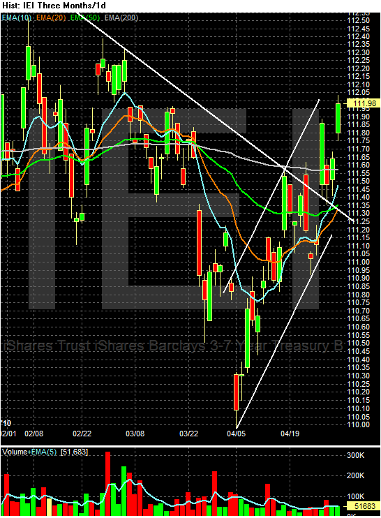
Prices broke through resistance on an upward gap (a), fell to the resistance level and are now rallying to the 200 day EMA. The EMA picture is turning bullish, especially with the 10 and 20 day EMAs about to move through the 50 day EMA. Finally, notice the volume spike from last week at (e).

Notice similar patterns across the curve:


The 3-7 year part of the curve is now above the 200 day EMA -- the line the delineates between bull and bear markets.


The IEFs (7-10 years) crossed over the 200 day EMA as well.


The entire Treasury market rallied last week. Also notice the volume spike across the board in all of these indexes. More importantly, the longer end of the market outperformed the shorter end, indicating that inflation expectations are clearly in check for now. This is in the face of a massive Treasury auction last week that went surprisingly well. In short, the safety bid of US Treasuries overcame the problems associated with the Treasury market.


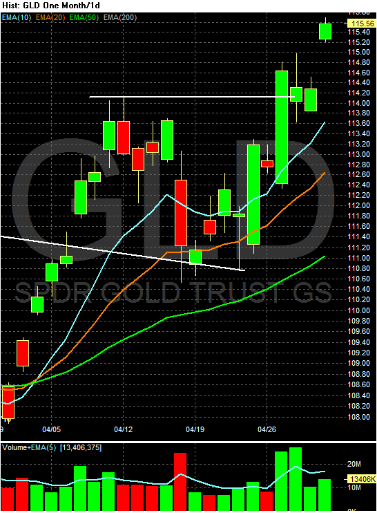
The gold market has caught a good bid. This is the top performing commodity of oil, the DBAs and the DBBs over the last 5, 10 and 30 day periods. There are two trendlines (a and b). There are also periods of rapid increases (usually on higher than normal volume) (a) followed by consolidation (d). The fundamental reason for this increase is the Greek situation, which is spooking investors.


On the daily chart, first notice that gold spent the first quarter of 2010 in a triangle consolidation bordered by lines a and b. But look closely at the A/D line. This indicator is a more advanced version of the on balance volume indicator. The A/D line is defined thusly:

A momentum indicator that attempts to gauge supply and demand by determining whether investors are generally "accumulating" (buying) or "distributing" (selling) a certain stock by identifying divergences between stock price and volume flow. It is calculated using the following formula:

Acc/Dist = ((Close – Low) – (High – Close)) / (High – Low) * Period's volume

The indicator works in the same way as the OBV which either adds or subtracts the day's entire volume to the line. In contrast, the A/D assumes that the closer the close is to the day's high, the more likely the security is being accumulated. Therefore, when a chart prints strong bars (large bodies, small shadows) more volume is either added or subtracted.

The A/D line under gold tells us that traders in general held onto their shares while GLD was consolidating at the beginning of this year. Finally, there were some very large block trades that went through at the end of last week, indicating there is strong fund buying.


Looking a bit more closely at GLD's breakout, we see that prices broke out of the top triangle line at point a, rose to (b), fell back to the top of the triangle at (c) and then broke through previous highs at point (d). Finally, notice that on Tuesday and Wednesday there was tremendous volume surges.


Saturday, May 1, 2010

Weekend Courtyard and Rooftop Jacuzzi

- by New Deal democrat

Since there weren't any doggies this week, I promised a few photos of somewhere else you should put on your list of places to visit at least once.

Here are three views of a beautiful interior courtyard...

Looking down from a balcony:

The view as you walk in from the street:

Another balcony view from a different perspective:


and one of the views from the roof:

Make sure you spend at least a few nights here sometime in your life.

Next week I'll post a few more photos and tell you the name of this place and where it is.

In the meantime, enjoy the beautiful May weather!

Share

Twitter Delicious Facebook Digg Stumbleupon Favorites More