logo

Showing posts with label BE. Show all posts

Friday, April 13, 2012

1955: Employment

Let's start with a look at the overall level of unemployment:


Remember that in the 1950s, the economy was operating at a very high capacity.  In addition, the economy as far less automated.  As a result, we see a very low unemployment rate -- dropping from 4.9% at the beginning of the year to 4.2% by year's end.


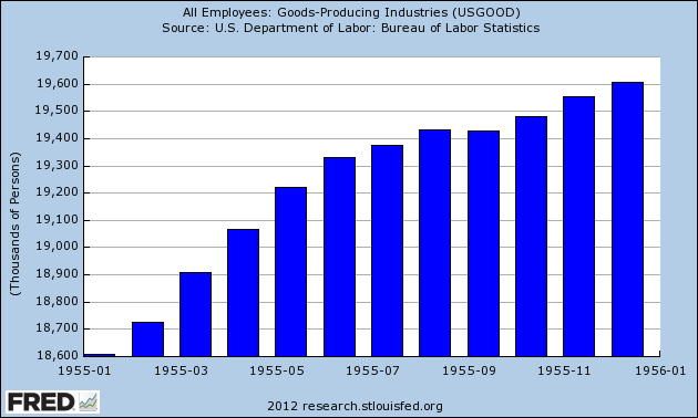
All three sectors of the economy -- manufacturing, service and government employment -- saw increases.  The manufacturing sector was growing because of the mammoth increase in consumer demand -- hence the increase of nearly 1 million jobs.  As households were formed -- and as incomes increased -- the demand for services naturally increased as well.  This explains the increase of over 1 million service jobs over the year.  And finally, the decrease in government employment at the beginning of the year was the result of the end of the Korean War.  However, by year end, the increased demand for government services (education, public works etc..) led to an increase in government employment.

The above chart from the Economic Report to the President, shows a nice slice of population, employment and unemployment.

As for wages, the level of employment led to strong wage growth:


The Federal Reserve Described the Situation Thusly:


The chart below (from the ERP) graphically depicts hours worked and wages.


Friday, March 9, 2012

1954: Government Spending

The above chart places total federal spending in perspective; we see a big increase in spending as a result of the Korean War.  Then we see a continued increase in spending to stimulate the economy out of recession.  However, government spending drops throughout 1954.


In the above chart, we simply see the actual numbers for expenditures and receipts.


As the chart above shows, the government ran a deficit for the year.  However, we see that spending and revenue were equal in the 4Q.

Remember that there were a number of tax cuts that went into effect to get the economy out of recession.  

Remember -- tax rates were far higher during this decade.  In addition, the government spend a a fair amount of money in conjunction with the tax cuts as a way to increase income during the recession.  This led to an actual increase in overall net income at the national level, thereby helping to prevent the recession from continuing. 

Notice that, despite the tax cuts, we see a decrease in receipts:


Remember -- tax receipts closely track GDP.

Finally, regarding the federal debt, we have this:


Monday, March 5, 2012

1954: Investment

This posting is part of the Bonddad Economic History Project.  The purpose of this is to go back sequentially through the US' economic history, starting in 1950, to simply see what happened from the economic side of the equation.  On the right side of the blog, you will see a link to posts that each contain links to the respective years.


The above charts shows investments contribution to GDP in 1954, along with the contribution of various sub-parts of investment.  While we see inventories helping in three quarters, I think the real story here is clear: residential investment was the largest contributor to the overall increase in investment spending in 1954.

Consider  the following chart:
Also consider this chart, from the 1954 Economic Report to the President:


As the Federal Reserve noted in their 1954 report:


Notice the mammoth increase in mortgages for the entire four year period.\\

Wednesday, February 29, 2012

1954: PCEs


The above chart shows the percentage contribution PCEs made to to GDP for the four quarters of 1954, along with the contribution of various sub-parts of PCEs. Note the incredible strength of PCEs -- consumers are spending a lot of money on an assortment of items.


The above chart is from the Economic Report to the President, 1955.  It simply highlights the incredible growth in a variety of conumer goods that were purchased by consumers during this time.  As the report highlighted:


Also consider the following chart:


 The above chart shows PCEs, income and sales.  Notice that we don't see an increase in disposable personal income until the end of the year.  This is due to the recession which lasted until July 1954.  However, thanks to a well-executed policy to limit the impact of the of the slowdown, the recessions overall effect was mild (from the ERP):


The above chart highlights now consumers continued to purchase a constant amount of durable goods, but expanded their purchases of both services and non-durable goods.

Also helping this process was the consumer finance sector, as noted by the Federal Reserve:


Thursday, February 23, 2012

1954: An Overview Of GDP and Its Subparts


The above chart shows the percentage change in GDP and the contributions made by its various sub-parts.   The data is very revealing, while the expansion of the early 1950s was caused by a combination of government spending (from the Korean War) and pent-up consumer demand, this expansion is starting off with a big increase from PCEs and investment. We see PCEs increase strongly starting in the 2Q and continuing through the end of the year.  Investment contributions slightly to the 2Q, but really kicks into gear in the third and fourth quarters.  Net exports are an after-thought.  And government spending is actually subtracting from overall growth.

Wednesday, February 22, 2012

The Recession of July 1953-May 1954 In FRED Charts

This post is part of the Bonddad Economic History Project

Last week, I looked at the story line of the recession of July 1954-May 1954 as told by the 1954 Economic Report to the President.  Very briefly, overproduction led to excess supply, which had to be culled by lowering supply, leading to lay-offs.  Here, I simply want to look at two years worth of macro level data to show what happened statistically.


On a continuously compounded annual rate of change chart, we see that GDP contracted for three quarters -- 3Q53-1Q54.  Two of these contractions were fairly shallow, coming in at -2.5% or less.  However, the 4Q of 1953 showed a deep contraction of over 5%.  Also note the quick response by the economy, which printed over 7% growth at the end of 1954.


Interest rates were already very low in the early 1950s (far lower than I would have imagined).  However, we see the Fed lowered rates near the end of the recession by 50 BP as a way to stimulate the recovery.


The above chart of the unemployment rate is the real story of the recession.  We see a big jump in the unemployment rate starting in late 1953 and lasting for most of 1954.  However, also remember that the economy was at full employment when the recession started, largely because of two issues: the Korean War and the US supplying consumer products to satiate pent-up consumer demand.  AS a result, the economy was at an incredibly hot level which was bound to cool at some time.


The above chart of total establishment jobs looks at the picture from  another angle -- namely, the total amount of jobs in the economy.  We see a contraction of about nearly 1.6 million jobs in the period of about  year.  Also note that the total number of establishment jobs was far lower during the early 1950s economy -- we were a much smaller labor force.


Remember that the US labor force was far more blue color during the 1950s, with about 40% of the  labor force being involved in manufacturing or construction jobs.  In addition, we were the world's producer of goods because everyone else was bombed into nothingness.  So, we had a massive manufacturing plant (which was also geared up to supply the Korean War effort).  As such, this sector took the brunt of the lay-offs in the recession, accounting for about 1.5 million of the lay-offs.


In contrast, we see the service sector actually had a near net o% gain for 1953, but an addition of 400,000 by the end of 1954.  In short, this was a manufacturing recession.


Another way of looking at the recession is from the industrial production perspective, where we see a large drop in overall IP.  This was caused by a slowdown in war purchases along with a drop in the demand for consumer durables.


The above two charts show PCEs percentage contribution of overall GDP growth in 1954, along with the contribution of various PCE sub-categories.  Pay particular attention to the red bar, as this shows consumers' durable purchases.  Notice the steep dive these purchases took during the recession.  This was a big contributor to the drop in manufacturing jobs, as fewer cars and other durables purchases directly impacted manufacturing output.

Share

Twitter Delicious Facebook Digg Stumbleupon Favorites More