logo

Wednesday, March 31, 2010

ADP Sees Job Loss of -23,000


From ADP:

Nonfarm private employment decreased 23,000 from February to March on a seasonally adjusted basis, according to the ADP National Employment Report®. The estimated change of employment from January 2010 to February 2010 was revised down slightly, from a decline of 20,000 to a decline of 24,000.

The March employment decline was the smallest since employment began falling in February of 2008. Yet, the lack of improvement in employment from February to March is consistent with the pause in the decline of initial unemployment claims that occurred during the winter.


Let's go to the data:


First, service industries are adding jobs and have been for the last several months. Goods producing industries are still the laggards. Also notice that small firms are the ones adding the most jobs.

Bloomberg highlights the primary reason for the last of growth:

Companies are still hesitant to add workers until they see sustained sales gains and are convinced the economic recovery has taken hold. Economists surveyed by Bloomberg News anticipate the government’s report April 2 will show payrolls increased by 184,000, in part due to temporary hiring by the federal government to conduct the 2010 census and because of better weather compared with February.


This is what economists call "visibility" -- it refers to the comfort people have looking out a few years and saying, "I see growth". The problem is right now there is little to no visibility; hence, we're still seeing modest job cuts.

Case Shiller: Good News and Bad News


First, the good news:


The rate of decline on a YOY basis is now very close to 0. That is good news. BUT


The month to month number has stalled out. From here, a sideways move wouldn't be a bad thing - in fact, I would personally not mind a bit. However, a sideways move can easily change into a downward move which is my biggest fear.


Compounding the problems with the last report is the above chart which shows that only two cities saw a month to month increase in housing prices. That adds further problems to the housing market -- problems we don't need right now.

Productivity and Employment


From the Washington Post:

When workers become more efficient, it's normally a good thing. But lately, it has acted as a powerful brake on job creation. And the question of whether the recent surge in productivity has run its course is the key to whether job growth is finally poised to take off.

One of the great surprises of the economic downturn that began 27 months ago is this: Businesses are producing only 3 percent fewer goods and services than they were at the end of 2007, yet Americans are working nearly 10 percent fewer hours because of a mix of layoffs and cutbacks in the workweek.

That means high-level gains in productivity -- which in the long run is the key to a higher standard of living but in the short run contributes to sky-high unemployment. So long as employers can squeeze dramatically higher output from every worker, they won't need to hire again despite the growing economy.

.....

Businesses have certainly not been investing in new equipment that might enable workers to be more efficient -- capital expenditures plummeted during the recession and are rebounding slowly. And the structural shifts occurring in the economy are so profound that one would expect productivity to be lower, rather than higher, as people need new training to work in parts of the economy that are growing, such as exports and the clean-energy sector.

.....

Instead companies squeezed more work out of remaining employees, accounting for a 3.8 percent boost in worker productivity in 2009, the best in seven years. Which raises the question: Why couldn't companies have achieved those gains back when the economy was in better shape? The answer to that may lie on the other side of the equation -- employees.

Workers were in a panic of their own in 2009. Fearful of losing their jobs, people seem to have become more willing to stretch themselves to the limit to get more done in any given hour of work. And they have been tolerant of furloughs and cutbacks in hours, which in better times would drive them to find a new employer. This has given companies the leeway to cut back without the fear of losing valuable employees for good.

First, consider charts:


The percent change in overall business output since the beginning of 2009 has been on the rebound, turning positive in about mid-2009.


At the same time we say an overall increase in output, we also saw a big spike in the output per hour of person.

So - why is this happening now? I think the last paragraph nailed the real reason: panic. People were looking around themselves and noticing that companies were really cutting back. Then they saw the national unemployment numbers and became extremely grateful for having a job. At this point, employers realized they could really push people hard and expect little to no blow back (people leaving/come type of confrontation etc..).

What's important to note is this set of circumstances can't be duplicated; they are unique to the economy as it currently exists. When we start to see less labor market slack, more consecutive periods of growth and lower unemployment, this situation will slowly disappear.


Yesterday's Market


I have added some moderately arbitrary high and low lines to make a simple point: the markets have been in a very narrow range with very little happening to either the high or low end. When looking at either the SPYs, QQQQs or IWMs, there is very little to get excited about. The vast majority of action is occurring on small price swings. Also note the very neutral EMA picture -- there is little separation between the EMAs and all are floating around the 200 minute EMA. In short, this has been a very boring market this week.

The Great ISA Rip Off

The Times reports that the Isa tax break created by Gordon Brown to encourage people to save has turned into a £3BN a year rip-off operated by the banks.

That at least is the conclusion of Consumer Focus (CF), a consumer watchdog.

Consumer Focus has made a formal complaint to the Office of Fair Trading (OFT)alleging that cash Isas pay derisory rates of interest and that banks use unfair obstacles to stop people from switching to better deals.

Mike O'Connor, CEO of Consumer Focus, is quoted:

"It beggars belief that in 21st century Britain it takes a month to transfer information and funds from one bank to another.

The average Isa saver is getting a poor deal
."

It estimates that cash Isa savers are being denied between £1.5BN and £3BN.

It is hardly surprising that people do not trust the banks.

Wednesday Commodities Round-Up


Industrial metals started an uptrend (A) in early February. As prices rose, they consolidated in two downward sloping pennant patterns (C and D). In addition, we see several strong, upward gaps (B) indicating the rally has some strength. Pennant D broke the uptrend, but prices have broken out to the upside at E.


A.) The EMA picture is bullish: all the EMAs are moving higher, the shorter are above the longer and prices are above all the EMAs.

B.) Momentum is neutral, although the MACD is about to give a bullish crossover.

C.) We're seeing some money flow into the market, but ideally this index should be rising at a higher and faster level to be more bullish.

On the 5-minute daily chart, notice there have been four upside gaps (A, B, C, and D) and all have broken through important resistance levels (E, F and G).

Tuesday, March 30, 2010

Personal Income Unchanged and Spending Up


From the BEA:

Personal income increased $1.2 billion, or less than 0.1 percent, and disposable personal income (DPI) increased $1.6 billion, or less than 0.1 percent, in February, according to the Bureau of Economic Analysis. Personal consumption expenditures (PCE) increased $34.7 billion, or 0.3 percent. In January, personal income increased $30.4 billion, or 0.3 percent, DPI decreased $26.0 billion, or 0.2 percent, and PCE increased $38.5 billion, or 0.4 percent, based on revised estimates.

Real disposable income increased less than 0.1 percent in February, in contrast to a decrease of 0.4 percent in January. Real PCE increased 0.3 percent, compared with an increase of 0.2 percent.


Let's go to the data. Click on all images for a larger image.

Total compensation has been increasing since September.


But the increase is not coming from the manufacturing sector. This part of the economy has been hit very hard in the recession, meaning there is very little upward wage pressure. But also note this is a small section of the economy -- total goods producing wages account for 13.23% of total compensation.
With the exception of November, total service compensation has been increasing since July of last year. This sector accounts for 51% of total compensation.


Transfer payments have also been increasing.

Let's turn our attention to expenditures.

Real PCEs have been increasing since September.
The largest component of expenditures is on services, which account for 65.66% of all expenditures. With the exception of November, this category of expenditures have been increasing since last July.

Expenditures on non-durable goods (which account for 22.21% of all expenditures) rose steadily until December, but have risen for the two months since December.


Real durable goods purchases (which comprise the smallest amount of all PCEs) are in a funk. But that is to be expected in this kind of economy. Durable goods typically require longer-term financing. Households are currently lowering their debt ratios and are also concerned about the economy as a whole, leading to less spending on more expensive items.

The increases in PCEs are a prime, underlying reason for the increase in stocks related to consumer expenditures. For example


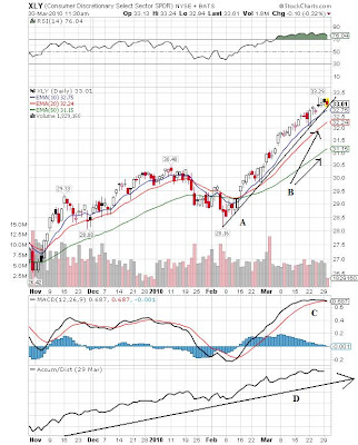
The XLYs (consumer discretionary stocks) are in a clear uptrend (line A). Also note the bullish EMA picture -- all the EMAs are moving higher, the shorter EMAs are above the longer EMAs and prices are above all the EMAs. The momentum is topping out, however (C), although there is still plenty of money flowing into the ETF (D).


The same analysis applies to the retail holders trust.


Housing Starts & Completions and Construction Employment

- by New Deal democrat

An anonymous commenter raised a good point in response to yesterday's entry, in which I said that, housing permits having bottomed, residential construction jobs presumably had as well. The commenter pointed out that housing completions were still in excess of housing starts, so there were probably continuing layoffs in residential construction.

I think the point is well taken, but let's take a closer look. The first graph compares housing starts, in blue, with completions, in red:

Sure enough, there are more completions than starts, although in the last year that gap is narrowing.

In the second graph, I've added construction jobs in green, right scaled. Note that the data doesn't permit you to break down residential vs. commercial construction jobs. Also note that economagic, where the graphs were generated, only allow annualized monthly changes, so the figure is noisier than I'd like:


Again, sure enough, construction jobs seem to correlate with the gap between starts and completions.

To smooth out some of the noise in the graphs, in this last graph the blue line depicts the difference between starts and completions. Note that the series turned negative and is still so, as there are still more completions than starts. The red line in this graph is the one year change in construction jobs (which means the line lags by six months):


In summary, the commenter's point is well taken, but I would add the following:

1. Layoffs in residential construction now are probably much less than they were a year or two ago.
2. The trend in starts vs. completions suggests that the gap will be closed at some point in the next 6 months.
3. At that point layoffs in residential construction will probably end, but because of the lag in commercial construction, layoffs in construction generally will continue to be recorded. This will be the mirror image of what readers of Calculated Risk will recall from 2006 and early 2007, when construction jobs seemed to levitate even though housing starts had taken a cliff-dive.

Treasury Tuesdays


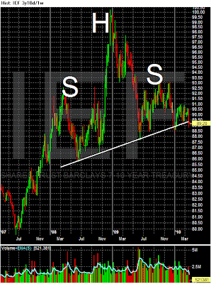
First, remember that Treasury prices are at the far side of a head and shoulders formation.


A.) In the last week, we've seen prices move strongly lower. First, note the gaps, indicating a serious change in the supply/demand equation. In addition,

B.) Prices are forming a possible price island below the neck line of the head and shoulders pattern.


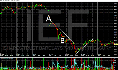
The daily, 5-minute chart shows the price action in more detail. First, we see the gaps power at points A and B. Next,


Notice that prices have found upside resistance at the 50% Fibonacci level.

Yesterday's Market

Consider all the following charts and notice that all except the QQQQs are right at technical support.


Monday, March 29, 2010

Why is the Bond Market Selling Off?

This article appeared on Sunday on the blog fivethirtyeight.com. It sums up my thoughts regarding the current situation in the bond market, and more specifically, what the situation means in the broader picture.

Last week three auctions of Treasury securities
did not go as well as hoped:

Demand waned at this week’s auctions of two-, five- and seven-year notes as signs of improvement in the economy boosted appetite for higher-yielding assets.

At the $32 billion seven-year note sale on March 25, investors bid for 2.61 times the amount of debt on offer, the least in 10 months.

The $42 billion auction of five-year debt a day earlier drew a yield of 2.605 percent, compared with the average forecast of 2.556 percent in a survey of eight of the Fed’s 18 primary dealers. The difference of 4.9 basis points was the largest since July, based on Bloomberg surveys.

Investors bid for 3 times the $44 billion of two-year notes sold on March 23, the lowest since December’s sale.


These numbers are nowhere near Armageddon levels, but they are concerning because they came in lower than expected. In addition, consider these two charts:


The top chart is the IEF -- an ETF that represents the 7-10 year Treasury market. The lower chart is the TLT and it represents the 20+ year Treasury market. Both have formed a multi-year "head and shoulders" pattern. It's highly likely that Treasury prices are heading lower, leading to rising interest rates. Finally, consider this chart from the St. Louis Federal Reserve of the 10-year constantly maturing Treasury yield:


The Treasury market has been in a 20-year bull market. However, yields are incredibly low (they are currently just below 4 percent) which means realistically they only have one direction to go - namely, higher.

So -- does all of this add up to increasing interest rates? The answer is most likely yes. But it's important to ask the next question -- why are interest rates rising?

The answer is more nuanced. First, look above at the charts of the IEF and TLT. Both prices spiked at the end of 2008 and into 2009. The reason for this price spike is the safety bid -- that is, the stock market was dropping (in the last half of 2008 and first quarter of 2009 the SPYs dropped from ~120 to ~70 or approximately 41%) and investors were concerned about a possible depression so money moved into government debt which is the safest investment possible. In addition, the credit markets literally froze at the end of 2008 (see below), increasing the need for safety. But, since early 2009, stocks have rallied which indicates investors are more comfortable investing in riskier assets. This lead to money flows out of safer investments like Treasury bonds leading to the sell-off.

Adding further pressure to Treasury prices is the fact that credit markets are far more stable now. Consider the following:


The liquid, high grade corporate bond market has done well over the last year. While it broke the uptrend (A) it has moved in a sideways consolidation pattern for the last six months. There are two lines of support B and C.


The junk bond market is in the same boat. While it has broken the uptrends of A and B, it is currently moving sideways and has support at C and D.


The mortgage backed market is also in an uptrend (A). While momentum is neutral (B) there is plenty of money going into the market (C). Also note the Fed is nearly done with its purchase programs:

Mr. Bullard also said that though the Fed is on track to end its $1.25 trillion purchase program for mortgage-backed securities, it continues to leave open the option of returning if the housing market needs it.

The Fed has pared down its weekly purchases to about $10 billion, from a high of $25 billion to $30 billion at its peak. The central bank has $14 billion left to purchase in the next couple of weeks, according to latest data from the central bank.

"Yields haven't opened up, and we don't expect much to happen at the end of month, or at the end of program," he said. "All indications are that it's going to be a seamless transition."

Despite the approaching end of this program, the bottom hasn't fallen out of the MBB market. And finally, the A2/P2 spread has come in and has been stable for some time:

In short, we're far closer to normal.

The easing of the credit markets should be analyzed against the backdrop that the Federal Reserve has largely ended all its extraordinary measures to support the credit markets: From Ben Bernanke's testimony earlier this week:

Broadly speaking, the Federal Reserve's response to the crisis and the recession can be divided into two parts. First, our financial system during the past 2-1/2 years experienced periods of intense panic and dysfunction, during which private short-term funding became difficult or impossible to obtain for many borrowers. The pulling back of private liquidity at times threatened the stability of financial institutions and markets and severely disrupted normal channels of credit. In its role as liquidity provider of last resort, the Federal Reserve developed a number of programs to provide well-secured, mostly short-term credit to the financial system. These programs, which imposed no cost on taxpayers, were a critical part of the government's efforts to stabilize the financial system and restart the flow of credit to American families and businesses. Besides ensuring that a range of financial institutions--including depository institutions, primary dealers, and money market mutual funds--had access to adequate liquidity in an extremely stressed environment, the Federal Reserve's lending helped to restore normal functioning and support credit extension in a number of key financial markets, including the interbank lending market, the commercial paper market, and the market for asset-backed securities.

As financial conditions have improved, the Federal Reserve has substantially phased out these lending programs. Some facilities were closed over the course of 2009, and most others expired on February 1. The Term Auction Facility, under which fixed amounts of discount window credit were auctioned to depository institutions, was discontinued in the past few weeks. As of today, the only facility still in operation that offers credit to multiple institutions, other than the regular discount window, is the Term Asset-Backed Securities Loan Facility (TALF), which has supported the market for asset-backed securities, such as those backed by auto loans, credit card loans, small business loans, and student loans. Reflecting notably better conditions in many markets for asset-backed securities, the TALF is scheduled to close on March 31 for loans backed by all types of collateral except newly issued commercial mortgage-backed securities (CMBS) and on June 30 for loans backed by newly issued CMBS.

In addition, the Federal Reserve has been normalizing the terms of regular discount window loans. We have reduced the maximum maturity of discount window loans from 90 days to overnight for nearly all loans, restoring the pre-crisis practice. In mid-February the Federal Reserve also increased the spread between the discount rate and the upper limit of our target range for the federal funds rate from 25 basis points to 50 basis points. We have emphasized that both the closure of our emergency lending facilities and the adjustments to the terms of discount window loans are responses to the improving conditions in financial markets. They are not expected to lead to tighter financial conditions for households and businesses and hence do not constitute a tightening of monetary policy, nor should they be interpreted as signaling any change in the outlook for monetary policy.

And finally, there is the ending fear of a double-dip recession:

Huge Treasury supply is a definite, and ongoing, concern. But at least part of the weakened appetite for Treasuries is a matter of the fading of those stubborn fears of a "double-dip" in the economy. Investors ought not to wish for the economic conditions that would cause rates to fall from today's levels, let's remember. In fact, the stock market seems to "want" incrementally higher rates if they come for the favored reasons -- firmer economic activity and waning risk aversion.

The above information indicates the primary reason for the bond market sell-off is a healthier economy -- meaning, the credit market has de-thawed and investors are more interested in taking on higher levels of risk. Therefore, investors are pulling money out of the bond market and investing in riskier assets such as stocks, corporate bonds and junk bonds.

Mike Santolli of Barron's (cited above) mentions the second reason for the dropping prices: increased Treasury supply. The US has a large budget deficit. To fund that deficit it has to issue an increasing amount of debt. At some point, the US will have to offer a higher interest rate (and a lower price) to attract buyers. Is that happening now? To an extent, but right now it's not the dominant factor. While the dropping bid-to-cover ratios and offering yields of last week's auctions are bad news, they are not dropping to anywhere near panic levels. The evidence indicates what we are primarily witnessing in the bond market is a return to a healthier financial situation -- risk appetite has returned leading to the movement from bonds to stocks. This is a standard move in the financial markets in the early stages of a recovery (for more information, I would highly recommend reading John Murphy's Intermarket Analysis; Profiting From Global Market Relationships).

As food for thought consider this point: interest rates are currently at 4% -- an incredibly low interest rate. But look at the 20 year Treasury yield chart from above. In the 1980s the US had interest rates of 7.5% - 10% and the economy still grew at a healthy clip. This leads to the conclusion that rising interest rates from an incredibly low historical level isn't anywhere near as fatal as portrayed.

Finally, note this graph of expenditures at the federal level:


Interest payments account for less than 10% of federal expenditures. Simply put, we have a fair amount of room in the federal budget for interest expenditures.

In conclusion, we are seeing a move to a healthier economic environment where investors are more comfortable taking on more risk. That is the primary reason for the increase in long-term interest rates.

Welcome to Abnormal Returns and Alphaville Readers

We are glad you are here and flattered to be mentioned on both blogs.

The "Jobless" part of the Recovery is probably ending ... except for Construction

- by New Deal democrat

This week is probably going to end with some good news about employment. When nonfarm payrolls are released on Friday, almost everybody, even pessimists, expects it to be a positive number. In part this is a triviality, because the Census Bureau has probably hired about 100,000-150,000 people this month. But even without that added (and very temporary) boost, most forecasters are looking for actual job growth in March. As I type this, according to Briefing.com, the median forecast for the private ADP employment report, which does not include government jobs, is +40,000. The median forecast for nonfarm payrolls including the census workers, is +190,000, meaning somewhere between +40,000 and +90,000 jobs other than the Census are expected to have been added to the economy this month. Most forecasters are also calling for unemployment to be unchanged at 9.7%.

Turning to the unemployment rate first, according to the Economic Cycle Research Institute, which made a stellar call[pdf] last spring when it predicted an end to the recession last summer -- it would be unprecedented for the unemployment rate to climb back up to its October levels.
“You have never had a four-tenths-of-a-point decline in the rate and then see it go up to a new peak since the end of World War II, [ECRI Research Director Lackshman] Achuthan said [on March 9]... “The unemployment rate already peaked.”
Indeed, the drop in the number of longer term unemployed also suggest that the high water mark for U-3 unemployment appears to have peaked at 10.2% last October:


The broader U-6 unemployment measure also appears to have peaked, at 17.2% last October as well:

If this is indeed true, then the unemployment rate will have peaked only 4 months into the economic expansion -- much sooner than either of the 1992 and 2002 "jobless recoveries," in which the unemployment rate peaked 15 months and 21 months after the recessions' end, respectively.

Turning to jobs, a variety of other indicators also are strongly suggesting that job growth is beginning and will last at least a while. The employment data from the separate household survey turned positive 2 months ago - traditionally something that signals the imminent turn in the nonfarm payrolls survey:


Railroad carloads for March have been improving, and also compared with last year:


Receipts for withholding taxes, which had also lagged, look very much like they will be about 2% or more better this month than in March 2009. The Conference Board reported that their "Employment Trends Index" also suggests imminent job growth, and the Challenger Gray and Christmas firm, which keeps track of large layoffs, says they have shriveled, that companies are beginning to convert temporary hires into permanent ones, and that we are "poised for job growth."

As reported by Barrons, most forecasters are calling for GDP to run just short of 3% this year, and even pessimists have it in excess of 2%. While that isn't stellar, it will mean that YoY GDP as of now is approximately 2.5% -- historically enough growth to suggest that there will YoY job growth in about the 3rd quarter of this year, as shown in this graph which subtacts 2% from YoY GDP (blue) and compares it with YoY job creation (red):

- which to be achievable would have to start now.

Additionally, the Leading Economic Indicators, while soft in January and February, have remained positive, and early indications are that March will be a good month as well. That is an excellent indication that there will also be GDP growth in the second quarter, which will make the YoY GDP comparison even better in 3 months, suggesting that job growth is going to continue at least well into the second half of this year.

If real job growth is reported on Friday, it will mean that jobs will have been added to the economy 9 months after the trough in GDP at the end of the second quarter of last year -- longer than the 2 months it took in the 1992-93 "jobless recovery", but much shorter than the 21 month lag in the 2002-03 "jobless recovery":


All of this is legitimately good news. While it is by no means a "V-shaped" jobs recovery, it is nevertheless considerably "less bad" especially as to unemployment than just about everybody imagined. In political shorthand, the stimulus has worked.

But one area that is continues to lag, and is going to be a drag on the economy at least for the remainder of this year, however, is construction. In fact, leaving aside construction, the economy actually started to show job growth at the end of this year, as shown on this graph of monthly jobs added/lost in which overall payrolls are in red, jobs in the service sector in blue, and all jobs minus the construction sector in green.


Back in September, I predicted that the bottom in jobs would be in November or December, +/- one month. Sure enough, service jobs turned positive in November. Indeed, leaving out construction, the economy as a whole actually added jobs in both January and February. But because of ongoing losses in the construction sector, the economy has still shed on average about 30,000 jobs a month since October.

Therein lays one way in which this recovery has been nearly unique -- the continuing weakness in housing, and the ongoing collapse of commercial construction, Typically in post WW2 recessions, real residential investment (investment in housing) led the way, first as evidenced in housing permits, and then in the manufacturing and transportation of goods to build the houses. Commercial construction began its own cycle about 12 to 16 months thereafter.


In the typical expansion, housing permits surged 50% or even 80% year over year as the expansion began.

Not so now. While real residential investment and housing permits both bottomed in the second quarter of last year, permits have only risen less than 20% year over year as of February. In short, this is the weakest housing recovery since world war 2.


If residential investment is tepid, commercial construction is still in a state of collapse. As this graph courtesy of Calculated Risk shows, architectural billings tend to lead commercial construction by about 9 to 12 months.

Those billings, if no longer in free-fall, are nevertheless still declining significantly, suggesting that commercial construction's collapse will continue through the end of this year.

That construction continues to exert a tremendous drag on employment shows up in the following graphs, which break out the overall employment (dark red) into service jobs (green), manufacturing jobs (orange), and construction jobs (blue) (NOTE: Unfortunately there is no way to further break down construction employment into residential vs. nonresidential).

In the typical postwar recovery, construction and manufacturing jobs, as well as service jobs, picked up almost immediately after GDP increased:


This pattern continued through the 1982 deep recession:


Then came the 1992 and 2002 "jobless recoveries." In both of these cases, it was manufacturing jobs even moreso than construction jobs which continued to be shed after GDP turned up. In 1992, construction jobs turned up at midyear, while manufacturing job losses continued for several more months:


In 2002, construction jobs stabilized before one last decline for several months in 2003, while manufacturing jobs continued to decline throughout the entire period:


Now, unlike every other recovery since the second world war, manufacturing has stabilized, even adding a few jobs in February, while construction continues to suffer steep declines:

One out of every 4 construction jobs has been lost in the last 3 years, the most in any post-war recession. There is no indication yet of a turnaround. Since housing permits have increased, albeit anemically, in the last 10 months, it is likely that almost all the losses in construction jobs have been in commercial construction (something I imagine almost every reader can correlate with the half-empty commercial strips in their own town or city), as to which the above graph from Calculated Risk indicates the decline is going to continue for at least about another year.


So, while it is likely that we will find out by the end of this week that we have turned the corner and are actually adding jobs in the economy, there will continue to be strong drag on growth from a pitiful construction sector for some time to come.

Share

Twitter Delicious Facebook Digg Stumbleupon Favorites More