logo

Wednesday, September 30, 2009

Random Musings

Are Parents Keeping Their Own Kids Out of the Workforce?

I have been exploring various methods of examining how our demographics are factoring into our economy. I think such an examination is all the more meaningful given the fact that boomers have seen such a dramatic decline in their net worth at a time they saw retirement on the horizon. The implications are, of course, vast, and many may stay in the workforce much longer than they’d ever expected.

Among the possible consequences of a workforce that pushes back retirement is the effect it has on new labor market entrants (e.g. it’s harder for them to find a job). I did some work on this over at Blah3.com, and present another analysis of it here.

I decided to look at the ratio of Employed 55+ to Employed 25-54. These two cohorts make up the vast majority of workers – only those 16 – 24 are omitted, and I did that deliberately to focus on those who are (presumably) more career-minded (or at least I’d hope).

The front end of the boomers – born in 1946 – started hitting the workforce in about 1971, and continued to do so until the last of them – born 1964 – entered in 1989. What we see couldn’t be more clear: As the boomers entered the workforce, they drove the ratio of 55+/25-54 ever lower, until it bottomed out in the early-to-mid 90s. As that same front end of the boomer generation hit 55 – in 2001 – that trend started to reverse, and has been going up as successive years of boomers hit 55 and stay in the workforce. There is no telling how much higher this ratio might go, or if it will hit a new high, but that would certainly not surprise me.

The irony of it is this: We spend a fortune to put our kids through school, only to now have to keep our own jobs longer and effectively freeze them out of the work force. (Click through for larger images.)

For some fascinating further reading on demographic trends and the movement of boomers through the system, see here (.pdf).
Some Thoughts on Today’s GDP Release

Taking a look at today’s final Q2 GDP release, some items stood out:

PCE as a contributor to GDP has been down in four of the last six quarters. This is unprecedented. I’d further note that Q2 of 2008 – which got goosed by the Bush stimulus to nowhere – printed as a +0.06 contribution. Without that stimulus, there’s no doubt at all that PCE would be a negative contributor in five of six quarters.

We’ve not seen anything like this in the history of BEA’s records:


Further, the six-quarter average contribution of PCE to GDP is now at a record low –0.86:
Exports and government spending carried the day today. Period.

Today's Markets


A.) The market sold-off on strong volume at the beginning of the day. Note the long bards and the high volume.

B.) After rising for most of the day, prices again broke lower on higher volume.

C.) Prices found support at the 61.8% Fibonacci level and rose into the end of trading.


A.) Prices are edging as close as possible to the upward sloping trend line. Friday's jobs report is looming large at this point.

Are Gas Prices Heading Lower?

Click for a larger image


A.) Prices have broken the upward sloping trend line

B.) There is strong resistance in the upper 35/lower 36 area.


Let's look at the sell-off in more detail

A.) Prices gap down. This is a bearish development as it indicates a big change in the supply and demand picture favoring the bears.

B.). Prices print a strong downward bar, a gap, and then a second downard moving bar. This is a big development. There is also strong volume on these down days.

C.) The 10 day EMA is moving lower and has moved through the 200 day EMA. The 20 and 50 day EMA are also moving lower.

Fed Governor Plosser On the Economic Outlook

From a recent speech:

Although many forecasters now expect growth to improve, they also expect the unemployment rate to rise to near 10 percent at the end of this year or the beginning of 2010. Actual numbers are trending in that direction. The unemployment rate climbed to 9.7 percent in August, even though nonfarm payroll jobs had the smallest decline so far this year.

I too anticipate that the unemployment rate will continue to creep up for a little while longer. We will continue to hear about this as a concern in news reports in coming months. Yet, we know that the unemployment rate is a lagging indicator. We will see the unemployment rate come down only well after the economy begins to recover.


Unemployment is a lagging indicator? Who knew!

Seriousl, let's place the employment picture in a very necessary context. At the beginning of this year we were printing job losses in the 600,000/month range. An economy as large as the US and one that experienced that amount of pain is not going to turn around it's employment picture overnight. Consider the following chart of job losses from the latest employment report:


For four months we experienced job losses over 600,000. That means the following 9-12 months are pretty much dead issues from a growth perspective. To expect otherwise -- that is, to expect unemployment to drop or hold steady -- is just plain stupid. What that means is we need to put policies in place that deal humanely with an increasing unemployment picture.

A key element of the improving outlook is the better news from the housing market. Housing sales and starts have generally shown improvement over the past six months, and even house prices appear to have bottomed out this summer.


See this post from yesterday.

The outlook for consumer spending is a mixed bag. The good news is that while the "cash for clunkers" effect on auto sales appeared to be significant, measures of consumer spending that exclude automobiles and gasoline have stabilized and the prospects have improved somewhat. Nonetheless, there are reasons to remain cautious in one's outlook: employment remains weak and housing values, while showing some signs of life, remain well below their pre-crisis levels. On the other hand, increases in equity values have helped restore some strength to household balance sheets.


This remains the big issue for the outlook. As Invictus has written, there are strong reasons to be incredibly concerned about the prospect for consumer spending. However, I am more optimistic about the outlook. Only time will tell who is right.

Wednesday Commodities Round-Up

Interesting developments in the copper market.

Click on all images for a larger image


A.) Prices are just below the long-term upward sloping trend line. Now, prices have not make a solid break through the trend line -- we don't have a strong downward moving candle. Instead we have prices consolidating just below the trend line. That could mean that instead of a break in the trend line we are seeing a new point to connect the low points; we need more data before we can make a final determination.

B.) There are three things we ultimately look for in technical analysis: reversals, continuations of current trends and divergences between technical indicators and price action. Point B looks like a rounding top pattern.

C.) Notice the MACD has been declining for two months. This tells us that momentum is decreasing.


A.) This shows us a better image of the trend break. Notice that prices have formed a very weak trend break -- the candles are very weak.

B.) Prices have run into a great deal of resistance in the 40.50 - 41 range.

C.) The 10 day EMA is moving lower and has crossed below the 20 day EMA. The 20 day EMA is moving lower as well. This tells us the short and intermediate trends are bearish.

Tuesday, September 29, 2009

Today's Markets


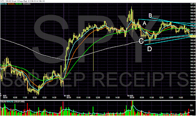
The primary point of this chart is to show that for the last two days prices have been trading in a narrow range (roughly 50 cents with the exception of this morning's price action).


The purpose of this chart is to show that sometimes the analysis is far from clear. Note that on the top we have lives A and B. While line A is a longer duration and therefore more important, it doesn't connect the other points from later in the day. Line B connects the more recent points but is not as important as line A because line B is shorter in duration.

The same issues apply to the bottom lines. I personally like line C because it connects a large number of points. Using this line we could see that prices already moved through lower support and are holding on to the 200 minute EMA.

Putting this all together we see that prices have been consolidating for the last two days and are looking for a direction to move.

A Note on the Housing Market


Click for a larger image.

The existing home sales market is by far the largest of the housing markets. Notice that over the last roughly 2 years the pace of sales has stabilized between (roughly) a 5.25 million and 5.75 million annual pace. That is what a bottom looks like.


New home sales appear to have bottomed at the end of this year and are now increasing.

The increase we've seen in both of these numbers will likely drop over the next few months; home buying typically increases up to the end of the summer when before the start of the school year.

There has been a lot of internet chatter about the shadow inventory: these are homes that are in the process of being foreclosed on but have not yet been sold. In other words -- there are a slow of homes out there ready to hit the market to create another set of problems.

The WSJ did an analysis of this problem. Here is their conclusion:


As of July, mortgage companies hadn't begun the foreclosure process on 1.2 million loans that were at least 90 days past due, according to estimates prepared for The Wall Street Journal by LPS Applied Analytics, which collects and analyzes mortgage data. An additional 1.5 million seriously delinquent loans were somewhere in the foreclosure process, though the lender hadn't yet acquired the property. The figures don't include home-equity loans and other second mortgages

Moreover, there were 217,000 loans in July where the borrower hadn't made a payment in at least a year but the lender hadn't begun the foreclosure process. In other words, 17% of home mortgages that are at least 12 months overdue aren't in foreclosure, up from 8% a year earlier.

Some borrowers may be able to catch up on their payments or receive a loan modification that helps them keep their home. There has also been an increase in short-sales, transactions in which at-risk borrowers sell their homes for less than the loan amount, with the lender's approval. In some cases, lenders have decided not to foreclose because the home's value is so low. These factors could mean fewer foreclosures.

Foreclosed homes are partly responsible for the recent increase in home sales. But foreclosures also push down home values. According to Collateral Analytics, a housing research firm, homes that have been foreclosed on typically sell at a 10% to 50% discount.

.....

But the number of foreclosures is expected to increase in the fourth quarter as mortgage-servicing companies determine who is eligible for a loan modification and who isn't. "We are going to see a spike from now to the end of the year in foreclosures as we take people out of the running" for a loan modification or other alternatives, says a Bank of America Corp. spokeswoman. Foreclosure sales had dropped to "abnormally low" levels in response to government efforts to stem foreclosures, she adds.


The recent Case Shiller indicates that prices are increasing on a month to month basis


And decreasing at a lesser rate on a year over year basis:


My guess is the following will happen. Prices will be under pressure for some time. However, prices have also moved to a level where prices are very affordable and where they are attractive investment purchases. In other words, the sales pace will at worst remain stable.

Getting it wrong about the CS-CPI

- by New Deal democrat

One of the most interesting alternate measures of the economy was first posted a couple of years ago by Tim Iacono of The Mess that Greenspan Made. The CS-CPI is the consumer price index, with the Case Schiller house price index substituted for owner's equivalent rent. In that manner it captures the impact of price changes in the biggest asset most consumers will ever buy, on the inflation rate.

I have mentioned several times how research into the Roaring Twenties and Great Depression showed that it was when the year-over-year rate of inflation (really, deflation) bottomed and started back up, that the economy started to recover. I correctly suspected that the same scenario would play out this summer.

But I always suspected that the "real" bottom in the economy might be when the CS-CPI bottomed, meaning that the deflationary pressure on all things bought or sold by average Americans, including houses, was beginning to ease. I hadn't read any updates about the CS-CPI since February, but a post within the last week by Mish, claiming that the CS-CPI was at an all-time low, caused me to take another look.

Well, it turns out that Mish simply reprinted the very same graph, and the very same text, he had used back in February -- and it makes a big difference.

I have calculated the CS-CPI for January of this year (cited by Mish) and compared it with the CS-CPI now (calculating OER as 25% of total CPI, and once obtaining the value for the remaining 75%, re-doing the calculation using the Case-Schiller index, just updated this morning). It turns out the CS-CPI bottomed earlier this year. In January the CS-CPI was (-10.1%). Now it stands at (-5.3%).

In summary, the deflationary pressures on average American families are decreasing. And Mish's latest post is simply wrong.

China Turns Inward For Growth

From the WSJ:

Chinese businesspeople like Mr. Tseng are adapting to what they believe will be a lasting consequence of America's deep recession. Savings by suddenly frugal U.S. households soared to an annualized $566 billion in the second quarter, more than quadruple the rate at the start of 2008. While that is important to rebuilding U.S. financial health, it is also sucking demand out of the world economy. China's exports, after growing for years at a steady 20%-plus rate, recorded a year-over-year drop last November. They kept falling, and in August were down 23% from a year earlier.

Spending by Chinese consumers, meanwhile, is holding up pretty well, partly because of heavy stimulus spending by a government flush with cash. Urban household spending in China was up 9.2% in the first half of 2009, not far off the country's average overall growth in recent years.

This shifting dynamic shows how the global economic turmoil is pushing China, the world's second-largest exporter after Germany, to become a more inward-focused economy. Even once world growth gets back on track, China is likely to run into limits on how much more it can expand its export market share, economists say. The World Bank expects that slower export gains in the future will shave about two percentage points off China's historical growth rate of 10%.

With the recession, Chinese exporters have been taught the dangers of a narrow business model. "The lesson we learned from the financial crisis is not to put all your eggs in one basket. We relied too much on the U.S. market," says Mr. Tseng, a 42-year-old native of Taiwan. "If we had started domestic sales earlier, our business wouldn't have declined so much this year."

Chinese domestic demand isn't a panacea for exporters. For one thing, domestic demand itself can suffer to some extent when exports decline, because the jobs of so many Chinese are linked to export industries. In addition, China's consumers simply don't have the money to drive the global economy in the same way as big-spending New Yorkers and Parisians.


This had been a wild card in the recovery game -- China becoming a demand center for consumer goods. The logic is simple: the country has experienced on of the largest growth spurts of any economy in some time. Some of that money has translated into higher living standards and an incredibly high savings rate. But as people see their incomes increase, they want more things. This is called the wealth effect and its a natural by-product of a growing economy.

There is no formula for how much of the growth will translate into increased consumer spending. That makes this idea a wild card for the next world expansion. But don't be surprised to the Chinese consumer taking on a larger role as the world economy recovers.

Treasury Tuesdays


Notice there are two upward sloping trendlines that connect the lows on the long term chart. Also note that prices have held above that support even though prices have sold-off.


A.) Prices have run into upside resistance before only to be rebuffed.

B.) Prices crossed over the 200 day EMA, indicating a more from bear to bull market.

So -- what gives with the Treasury market? Frankly, I though the large amount of supply that is hitting the market (and will continue hitting the market) would provide strong enough downward pressure to keep prices moving lower. But that has not happened. Despite record issuance, bond purchases continue to keep up with increased supply. That means there is plenty of demand for the new issues (at least for now). In addition, there is continued talk of the stock market rally being tired/in need of a sell-off etc... So long as there is talk along those lines, Treasuries will be an attractive investment alternative to stocks.

Advice To The Co-operative Bank II

Despite forwarding the Co-operative Bank with a copy of my piece the other day about being bombarded with calls from their automated dialler, and despite pressing the correct buttons on my phone to remove my number from their database, they persist in calling me and asking for an unknown female.

Are these people completely incompetent?

I am very glad that I do not have an account with them, but wonder what it will take to get them to stop ringing me?

Monday, September 28, 2009

Today's Markets


Prices rebounded today on M&A news. Notice that prices moved to the 61.8% Fibonacci line and the sold off a bit.


1.) Prices gapped a bit higher at the open.

2.) Prices moved higher with strong bars on (3) higher volume.

4.) Prices consolidated moves higher.

5.) Prices found upside resistance at the 61.8% Fibonacci level.


On the daily chart we have good and bad news. The good news is prices rebounded from technically important levels (an upward sloping trend line). The bad news is occurred on low volume.

Why I'm Bullish: K.I.S.S. Edition

- by New Deal democrat

Since today is a dead economic news day, and since Bonddad and Invictus have weighed in on the linchpins for their current economic views (Bonddad noticed right track/wrong track numbers getting better, Invictus notes headwinds facing the average wage-earner/consumer), I thought I would add my own post simply stating why I am bullish on the economy.

As an initial point, though, I want to say that my viewpoint is not really much different from that of Invictus. Whether or not there is a "Recovery" really just hinges on two quarters of GDP growth, which I think will be satisfied by Q3 and Q4 2009. Like Invictus, however, I am extremely concerned by the headwinds faced by ordinary American working families. I have written several times this year how there cannot be "sustained" growth without the participation of the average consumer, and a consumer constrained by debt payments and miserly wage increases in not going to give us that sustained growth. It boils down to how long there can be substantial growth without broad participation. I suspect, to paraphrase Bonddad, it will proceed in "fits and starts" until the situation changes.

After the economy fell off a cliff last fall, the next question was, how deep is the abyss. And sure enough, things kept falling and falling and hey, wait a minute! Retail sales just rose in January! That was when I first suspected that the bottom of the cliff might not be too far off, and I wrote about it near the end of February.

But I also wrote a series looking at economic indicators of the Roaring Twenties and Great Depression, and that convinced me that if the Fed and the new Administration didn't screw up, the rate of deflation might bottom in or about July, and in the face of a positively sloped yield curve, that would signal the end of the "Great Recession." That is indeed what has happened.

OK, now to the K.I.S.S. part. Way back when I first started to be involved as an individual investor, I realized that there was no way the individual could compete with the resources available to the Big Boyz. What I wanted to do, was focus on a few measures that would take me no more than 1/2 hour a week and give me 80% of the information that the Big Boyz had. Very soon, among a few other things, I was led to the yield curve in the bond market, and the CPI and PPI, as predictors of the stock market, but also the broader economy.

In periods of inflation, the yield curve in the bond market has an almost flawless record -- since WW2, the only time it was incorrect was when the yield curve inverted in the mid to late 1960s. Aside from that, whenever the yield curve was positive, then 1 year later the economy was growing. Whenever it was inverted, one year later the economy was in recession. (Later Doug Kasriel of Northern Securities added the parameter of real M1 growth, and that made it an absolutely perfect record).

Last year blogger Theroxylandr posted a graph from Ned Davis research showing one very important exception -- the yield curve was positive throughout the entire 1930s, even during most of the "Great Contraction" from 1930-32. That was a potent wake-up all to examine how the yield curve performed in times of deflation, and hence my subsequent series on Economic Indicators during the Roaring Twenties and Great Depression. That series yielded two vital insights:

1. A positive bond yield curve does portend economic growth in a deflationary scenario, provided the deflation is easing, i.e., price changes are rising towards inflation.

2. An inverted yield curve in the presence of even 3 months of deflation is the Death Signal. In the last 90 years, it has only occurred twice. The first time was in 1928. The second time was in early 2007.

With those provisos, a positively sloped yield curve has pefectly predicted conditions over the next year for the last 90 years.

Always.

Every.Single.Time.

So, where do the yield curve and inflation stand now? Here's the graph:


The first thing to notice is that the yield curve is wildly positive. 3 month rates are still close to zero (red line), while the 10 year bond is between 3-4% (blue line). This is a portent of potent growth ahead for the next 12 months, provided we don't relapse into further deflation.

The second thing to notice is the relationship of CPI and PPI. Before recessions, both tend to rise, and PPI tends to exceed CPI. As recessions wear on, the relationship reverses, with both declining, PPI moreso than CPI. At the bottom (in deflationary busts), or shortly thereafter (in inflationary recessions), both start to increase, but YoY PPI is still well below YoY CPI. That's where we are now.

Barring speculators and/or the Chinese government thinking that somehow $100+ Oil is a neat thing, which seems pretty unlikely; or wages being actually cut (which is a possibility, but I suspect the threat is easing), we are in for a period of substantial GDP growth between now and next summer.

Rail Traffic Incrased In Third Quarter


The above chart is from Railfax and it shows that rail traffic increase in the third quarter. The reason this is important is simple: when an economy increases activity it has to ship more stuff from point A to point B. The increase in activity is a good overall sign, which explain why the above chart is so important.


The year over year chart shows a decline but a decline that is decreasing. Also note this is a great example of the shortcomings of year over year statistics at turning points. The first chart shows an increase in the 3rd quarter from 2nd quarter levels. This is a good indicator for the third quarter and adds yet another indicator that the economy is coming out of a recession.

Time Capsule Post: Open in One Year

Fast forward one year from now, to late summer/early fall 2010. According to most accounts, at that point we should be about one year removed from the trough of economic activity, otherwise known as the end of the recession. So let's say, for the sake of argument, that the recession ended in June, at the end of the second quarter (also, not coincidentally, the latest quarter for which we have some GDP numbers).


What should GDP look like in the first four quarters after a trough? What has it looked like in the past?


Average GDP in the first year of recovery -- going back nine recessions -- is, believe it or not, 7.11%. Raise your hand if you think we'll hit that bogey this time around. After the 2001 recession, however, GDP over the next four quarters averaged only 2.63%, and I fear we won't even do that much this time around.


Interestingly -- and this is the point of the post -- one category has led out of recession seven of nine times, and that is PCE. In the two first-years that PCE did not lead us out -- 1950 and 1980/81 -- Inventories did.


Here is what the average first year looks like:


So, the consumer has led us out of recession by averaging a 3.4% annualized contribution to GDP in seven out of nine (78%) recessions. Inventories, at two out of nine, place a distant second, and nothing else even comes close.

As David Rosenberberg recently put it:

Sustained recoveries hinge on the consumer. While the inventory cycle is key, the word cycle means more than a one-quarter bounceback in auto assemblies from depressed levels -- by definition a cycle implies a trend. So while Inventories play a supporting role after a recession ends, it is only perpetuated if the consumer revives. On average, consumer spending is responsible for over three percentage points of the bulk of growth in the first year of recovery. Housing is also a key contributor. But the consumer has already shown us that it is heading into a secular period of frugality and savings, while housing, notwithstanding signs of an upturn that are really little more than noise on a fundamental downtrend, is in a secular decline. Usually, government plays a small role, but this time around, it may be the only actor in the play, and what multiple does that deserve is a very good question, especially now that Uncle Sam's generosity is supporting a record of nearly 20% of personal income.

Shutting Stable Doors

Listen very carefully and you will hear the sound of a stable door being slammed shut by Darling and Mandelson.

Ahead of Alistair Darling's Labour conference speech outlining new rules to curb bankers' bonuses, Lord Mandelson spoke on BBC's Radio 4 programme.

He noted that Gordon Brown, as Chancellor, had introduced new legislation that "sorted out a ragbag of different regulatory processes" in financial services to make them "much leaner, meaner and more efficient".

Aside from the obvious point that the Tripartite system was hardly "leaner, meaner and more efficient", it is clear that if Darling is now having to introduce further regulations, it is clear that Brown's regulations weren't up to the job.

Mandelson will say later today that we rely too much on the financial services industry.

Fair comment, except this has been known for many years.

What exactly will he replace it with?

Later today Darling will outline plans to:

-End automatic bank bonuses year after year.
-End immediate payouts for top management.
-Defer any bonuses over time so they can be clawed back if they are not warranted by long term performance.

All very well.

However, as can be seen with the change of HQ for the CEO of HSBC, bankers will simply up sticks and leave.

The stable door may now be slammed, regrettably the horses have long since bolted!

Market Mondays

Let's take a look at last week's action. As always, you can click on all images for a larger image.


1.) Prices were in a slight uptrend for the first almost three days.

2.) Prices were in a tight range (from roughly 106.60 to 107.40) on Tuesday and Wednesday as the market awaited the Fed's decision.

3.) Once the Fed announced its decision the market tried to rally but couldn't maintain upward momentum. The rally stalled, fell through the trend line thereby breaking the weekly trend and continued falling. Note that prices consolidated in a triangle pattern at the beginning of Thursday only to continue falling. Triangles are both reversal and continuation patterns.

4.) Notice the incredibly high volume that occurred on the sell-off. This tells us that bears were in complete control. In addition, it also tells us that people were looking for a reason to sell.

5.) After the sell-off prices again consolidated in a pretty tight range (104.60 to 105.40).

6.) Prices wanted to move lower but couldn't. They eventually rose and then sold-off to resistance established earlier in the day.


There are two trend lines are important to this market. The first (2) connects the lows from early March and early July. The second connects the lows of early July and early September. Currently, prices are resting right at the first trend line in addition to the 20 day EMA.


Notice that prices at points 1, 2, and 3 display a similar pattern. They all involved a sell-off to points just below the 20 day EMA. The primary difference between the first two and point three is the volume. Point three has a higher volume level than either 1 or 2.

Headwinds

Invictus

I’ve made no secret of the fact that I have serious reservations about the sustainability of any strength in our economy. I’ve tried to document and chronicle most of the reasons for my doubts as I’ve seen them. (See any of my previous posts here or my hundreds of posts over at Blah3.com.)

I had a long talk with Bonddad this week about the nature of my skepticism. It all boils down to the consumer. Here is a follow-up to our conversation, and here are more of the reasons I'm not sold on recovery.

We know that the consumer has been 70% of GDP. I’ve written about it both here and elsewhere. We know that the consumer took his Debt/Income ratio to a very unsustainable 136% (now 129%), and that it was debt-financed consumption that contributed mightily to our current woes as we spent beyond our means and saved, literally, nothing for some time. I recently demonstrated that just to return Debt/Income to its trendline (114%) would involve retiring roughly $1.6 trillion, and getting back to the mean is virtually unthinkable. We know that the median age of boomers is now 52, and that this cohort is likely more concerned with retirement planning and rebuilding his/her nest egg than with aggressive consumption or aggressive investment strategies.

Beyond that, as I saw Joseph Stiglitz pointing out yesterday on Bloomberg television, this was not a recession caused by any of the typical reasons (e.g. manufacturing/inventory hiccup or the Fed hitting the brakes a bit too hard). This recession was born of the popping of a massive credit bubble that was years – if not decades – in the making, and will likely be years in the unwinding.

On to some interesting charts I saw this week in David Rosenberg’s work, and have taken the liberty of replicating. They (obviously) all support my thesis.


Above is yet another indicator of how weak the labor market is, as we see the number of people working part-time for economic reasons is easily at an all-time high. Yes, the labor market is usually a lagging indicator, but as I recently documented, its weakness this time around is far greater than we’ve seen in any post-war recession.


In part because of the slack in the labor market, we are now experiencing wage deflation, as “organic” income is on the decline:


Organic wages are on the decline. “Transfer payments” – more largesse from the government – are the only component of income that’s growing. (Note that I’m not arguing the government should not be stepping in, just pointing out that wages, dividends, interest income, etc., are all declining.)


Couple the decline in income with the fact that credit is now (very understandably) contracting:


As a result of both declining income and contracting credit, it stands to reason that Personal Consumption Expenditures would drop, and in fact they have:


I previously mentioned the median age of boomers, and in the past have written about the increase over the past several decades in Durable Goods/Household (now at about $37,000). Part of this growth was attributable to Boomers moving through their peak consumption years, which are now behind them.

Let’s take a look at another very interesting chart that flows from the increase in Durable Goods/Household: Vehicles on the Road/Licensed Drivers:


The question needs to be asked: How many more vehicles/driver are we going to put on the road? How many cars/driver do we really need? Further, I will respectfully disagree with Bonddad and state for the record that there’s little doubt in my mind that Cash for Clunkers pulled forward some (perhaps unquantifiable) amount of future sales. The run rate didn’t go from ~9MM annually to ~13MM annually on its own. Unfortunately, it appears we’re headed back down toward ~9MM again, so it’s hard to believe the Clunker program didn’t cannibalize some Q4 sales. Keep in mind, too, that scrappage is about 12MM vehicles/year so we are, in fact, taking cars off the road, which would be consistent with the trend of the chart above beginning to turn down.


The U.S. Homeownership rate, which had peaked at 69% and is now on the way down, still has a way to go on the downside (probably to about 65% or so):


Now, none of this is to say that the recession may not “technically” be over. However, as Paul Krugman recently noted, that may indeed be irrelevant. Based on some correspondence with members of the National Bureau of Economic Research’s Business Cycle Dating Committee, I’m led to believe that they’re inclined to view growth from all sources – be it it private sector or government – equally. So the life-support the government has provided may well be enough to “officially” declare an end to the recession. What the private sector looks like absent the public support, however, is another story altogether, and one that has yet to be told. That is the crux of my concern: How do crippled consumers take the handoff from the government when stimulus programs and funding begin to wind down and end. And therein lies the story of what I believe might well be a double-dip, or at the very least sub-par growth for as far as the eye can see.

Does Blogger suck, or is it me?

[Note to commenter on original post: The Boss asked me to hold the post until Monday, so I took it down and rescheduled it. Sorry for having lost your comment.]

Saturday, September 26, 2009

File Under: Where Have I Heard That Before?

Hmmm...the NY Times sounds vaguely familiar.

The Bonddad Blog, July 6, 2009:

Perhaps the most interesting piece of work Rosie produced recently was an analysis of how many unemployed individuals we currently have for each job opening. Rosie looked at the Job Openings and Labor Turnover Survey (JOLTS) data from the BLS and the number of unemployed (also via the BLS).

Rosie refers to this as “The Truest Picture of Excess Labor Supply,” and it’s hard to argue with that description. The Household Survey reports about 14 million unemployed, and the JOLTS reports about 2.5 million current job openings. Scary stuff.

The Bonddad Blog, Sept. 11, 2009:

The Bureau of Labor Statistics (BLS) puts out several reports. One of them – the Job Openings and Labor Turnover Survey (JOLTS) – doesn’t get wide play. In that report, BLS reports on the number of job openings (among other things). If we combine that report with some information from the Current Population Survey (CPS) – specifically the number of unemployed Americans – we can see the following:


Unfortunately, the JOLTS series only goes back ten years, but the picture this paints of slack in the labor market is not a pretty one, with fully six Americans vying for every job opening.

NY Times, Sept. 27, 2009:

Job seekers now outnumber openings six to one, the worst ratio since the government began tracking open positions in 2000. According to the Labor Department’s latest numbers, from July, only 2.4 million full-time permanent jobs were open, with 14.5 million people officially unemployed.

Friday, September 25, 2009

Weekend Vacation Photos

These are some random photos from our Alaska trip. They're in no particular order. Hope you like them -- and I'll be back on Monday.


The Week in Review: A mixed bag

- by New Deal democrat

Here we are at Friday afternoon again, and before Bonddad posts his much awaited photos and calls it a weekend, let's quickly recap the week.

Unlike last week, which was a full-throated battle cry of bullish data, this week was more of a mixed bag:

- Leading economic indictors for August went up 0.6% and July was revised higher 0.3%, but the underlying data is mainly already known.

- Initial Jobless Claims fell to 530,000, suggesting that the economy is getting closer to the point where it actually starts to create more jobs than it loses.

- Existing Home sales fell slightly in August. The market was apparently expecting Nirvana, and this hiccup (sales are still up YoY for the third month) helped cause a sell-off.

- Durable goods orders (which Bonddad sometimes calls "the Boeing report" because of the heavy influence of aircraft orders) fell -2.4%, taking back about half of the July gain. Ex-aircraft, the series was unchanged. The decline in capital new orders is troubling, but was already factored into the August LEI report so may have no effect.

- U. of Michigan consumer confidence for September rose to 73.5, up from August's 65.7, far above expectations. More importantly, the leading indicator of consumer expectations rose to 73.5, its highest since before the Recession.

- New Home Sales were reported up by the Census Bureau to 429,000 a whopping 3,000 more than the revised July report, i.e., not nearly as much as had been expected.

- the weekly Railcar report showed stabilization after last week's decline. YoY figures generally continue to improve.

- the American Trucking Association reported that its "Truck Tonnage Index increased 2.1 percent in August, matching July’s increase of the same magnitude.... Compared with August 2008, SA tonnage fell 7.5 percent, which was the best year-over-year showing since November 2008."

- Shoppertrak reported that "year-over-year retail sales declined 4.5% for the week ending Sept. 19, ... [but] current sales for the month of September versus last year are only down 1.0%."

The takeaway this week is that the Recovery proceeds but subject to what Bonddad has called "fits and starts." The leading components so far suggest that September's LEI will remain positive, but significantly weaker than the last 5 months.

In the meantime, let's wait on Bonddad's pix and have a nice weekend!

A Look At Getting Better/Getting Worse Numbers


The above chart is from Pollster.com. It is a combination of all the big polls regarding how people feel about the economy. This is one of the first polls that caught my eye back in the late spring. I hadn't looked at it since the election. When I saw the then big swing between March and May I was very surprised. This occurred at the same time we were seeing a dip in the 4-week moving average of initial unemployment claims. These two factors were what first convinced me the economy was bottoming out.

The above chart shows two trends. The first occurs from March to May and shows an increase from 10% to 25% of respondents who said the economy was getting better. The second goes from mid-July to now that shows a more gradual increase from 25% to about 35%. Conversely, the number of people who said things are getting worse decreased from 70% to 50% in the March to May period and the number again decreased another 5% to 45% in the July to current period.

These numbers are not stellar. However, they do track with the rest of the economic numbers that we are seeing which show a clear bottoming in economic activity. It's also important to remember a very important point: the US economy is not going to turn around in one day -- or even a year. We went through the worst economic shock since the Great Depression; something of that magnitude does not lead to quick recovery. But, things are definitely on the right track now.

When will the Economy Start to add Jobs? (VI.) A Conclusion and a Prediction

- by New Deal democrat

This is the Sixth of Seven articles in which I am examining when economic growth (GDP) will translate into job growth (the 7th will deal with the unemployment rate). In the first 4 articles I examined 5 potential leading indicators of job growth. In the 5th article, I showed how the leading indicators fit together temporally. What remained is the issue of whether there was enough "ooomph", enough strength, to push job growth over the top. Certainly I can say that historically when an indicator has reached level X, that has always occurred at the same time as actual job growth, but then it is no longer a leading indicator, just a contemporaneous report.

But jobs, or Employment, is one of 4 "Coincident Economic Indicators" (actually, the biggest, accounting for just over 50% of the index) kept by the Conference Board, along with Industrial Production, Real Income (a/k/a Personal income minus transfer payments), and Manufacturing and Trade Sales. Three of those four are also thought to be what the NBER tracks to determine if there is a recession or not. The difference is that the NBER includes our "holy grail", Real retail sales, as opposed to the Conference Board's Manufacturing and Trade Sales. This means, we have an excellent tool to estimate when Employment might turn positive, because it is this Index of Coincident Economic Indicators that is the exact thing that the Leading Indicators are supposed to lead!

Here is where the Leading vs. Coincident Indicators stood before this week's report:


Here is the St. Louis Fred's index of each of the 4 coincident indicators as of last month:


As of this week, while the Coincident index moved sideways, the Leading index is now up ~+2.3% YoY. If it merely meanders sideways for the next 3 months, it will be up over 4% YoY (and barring a sudden stock market meltdown, it looks like it will rise again in September). In comparison, the LEI was ~+5% when jobs started to be added even during the 2002-3 "jobless recovery."

More importantly, the Leading index is designed to lead the Coincident index by about 6 months, give or take 3 months. For our purposes, simply put, the Coincident index should cross zero at some point during that time frame. That means that the average of the 4 series should be at the same reading -- 0% YoY -- at about that time.

So therefore, for purposes of this analysis, I am making the following assertions that I believe are reasonable and probable:

(1) The average of the 4 Coincident Economic Indicators, which include Employment, will cross 0% YoY at some point between October 2009 and April 2010.
(2) Manufacturing and Trade sales (used by the Conference Board as a coincident indicator) will track Real retail sales (used by the NBER to date Recessions) closely, with a several month lag.
(3) the 4 coincident indicators will improve by roughly the same percent (or at least not diverge more than in previous recoveries) in order to arrive at the average of 0.
(4) Jobs will follow a relatively stable trend of improvement - there will be no wild fluctuations.
(5) Per my previous analysis, if both Industrial Production and Real retail sales advance more than 2.5% from their bottoms, Employment must be growing.

I am also varying the weighting given by the Conference Board to calculate the Coincident indicators slightly for ease of calculation.

With those parameters set, let's begin.

I. The above parameters mean, in summary, that in order for Employment not to bottom by the month Coincident Indicators average 0% YoY, both Industrial Production and Real retail sales must not have advanced 2.5% from their bottoms, BUT nevertheless, Industrial Production, Real income and Wholesale and Trade sales must be up sufficiently over zero as a group to compensate for Employment still being negative YoY.

For that set of parameters to be met, one of the two categories already advancing -- Real retail sales (wholesale and trade sales) and/or Industrial Production -- must stall (so that they are not both over 2.5% from their bottoms). But if one of them stalls, then to have a weighted average of zero at the crossover month, then the other of the two, together with the other laggard, Real Income, which only makes up about 15% of the index, must inexplicably surge by at 10%(!) (if we use the January 2010 crossover date), or 2% (if we use the easier 9 month target of April 2010) to make up for both the negative Employment number and the negative Industrial Production or Retail sales number.

The odds of all those conditions being met appear quite small. Even in the 2002 "jobless recovery," Industrial Production rose at most 1.7% and Real income 1.4% before the Coincident Indicators rose above 0% YoY. Thus, if the Leading Index simply works as designed, Employment must either be zero or higher YoY by January (give or take three months), or else Employment can still be negative YoY at that time but Real retail sales and Industrial Production must be at least 2.5% higher from their bottoms. Either way, it appears a extremely likely that by the time the Coincident indicators cross 0% YoY, Employment must have bottomed.

II. There is still one last item to consider, and that is whether there is a reasonable "glide path" or trend line that would be consistent with a bottom in employment as well as the weighted average growth of Coincident indicators being 0% YoY at the crossover month.

Since this past January, Employment is down -2.2%, Industrial Production is down -2.7% , Real income is down -2.3%, and Manufacturing and Trade sales, not shown, is down -6.3%. (940,862 Million in January, vs. 914,303 in June). To arrive at a weighted average of 0%YoY in January 2010, each of the above must improve on average 2.8%. In the case of Employment, that would mean the economy growing an average of 756,000 jobs each month for the next 5 months! That's not going to happen.

If we extend the time at which Coincident Indicators cross 0% YoY to April (9 months after when LEI's turned positive YoY), then since April 2009 Employment is down -0.9%, Industrial Production is up +0.3%, Real Income down -0.1%, and Manufacturing and Trade Sales down -1.3%. To arrive at a weighted average of 0% YoY in April 2010, each of the above must improve on average +0.6% from their present readings (actually, to comply with my +2.5% requirement, Industrial Production must still improve 0.8%, which means that Real income does not need to improve at all). In the case of Employment, that would mean adding a total of 426,000 jobs in 8 months, for an average of 53,250 new jobs a month. This can be done by a positive move of +62,500 a month, giving us the following nonfarm payrolls over the next 8 months:
Sept. 09 -145,000, Oct. 09 -91,000, Nov. 09 -28,000, Dec. 09 +34,000, Jan. 10 +97,000, Feb. 10 +159,000, Mar. 10 +200,000, Apr. 10 +200,000.

The above is just an example, adding +426,000 to total payrolls to meet the "0% YoY change in Coincident Indicators" constraint. Remember, though, that the purpose of this series is to try to estimate when the economy will begin to add jobs -- i.e., net +1 jobs. Using Leading vs. Cooincident indicators is a tool to do so. In other words, there are plenty of other "glide paths" that add jobs - although less than 426,000, if Industrial Production and Real retail sales both improve more. We just don't have the tools to estimate them well, although they must also be consistent with the analysis above.

Extending our crossover point to April gives us a "glide path" for Employment that looks perfectly reasonable and doable, given the strength of the Leading Economic Indicators. A slightly more aggressive "glide path" might possibly give us a positive number in November, if the target crossover date is March instead of April.

Let's review my analysis of when the Economy will begin to add jobs:

(1) ISM manufacturing and Industrial Production both suggest that Employment may well make a bottom as early as October.
(2) Initial Jobless claims suggest 3 months or longer, as does the slow improvement of Real retail sales. This puts us in December or January.
(3) The most likely month to give a reasonable "glide path" of actual job growth as indicated by the Leading Economic Indicators vs. Coincident Indicators is December, or possibly November if there is enough strength in the economy.

A recent graph prepared by Raymond James Investments shows the trends very well:


Note the trend since the December trough in payroll losses. Interestingly, this breakdown shows that it was May, not June, that was the outlier in the trend, as service businesses (green) had few layoffs that month. Nevertheless, the overall trend suggests that services could begin to add rather than lose jobs as early as this month, September! Manufacturing, in accord with the ISM index, may follow as early as next month, October. That leaves construction as the ongoing drag on job growth, and the question becomes, when will growth in services and manufacturing be enough to overcome construction losses.

Based on my analysis above, November or December are when I believe that turning point will be reached, plus or minus one month in either direction. Let me be the first to acknowledge that this is not a scientific truth or certainty, but a best estimate based on a logical review of existing data with a long history that accommodates both traditional and "jobless" recoveries. Nevertheless, at least in terms of payroll growth, the analysis in these six installments cause me to predict that this will not be a "jobless recovery" for long.

In my last installment, I will look at Real Retail sales as it relates to Unemployment.

Forex Fridays


1.) Prices formed a double top with the first top at the end of last year and the second top at the beginning of this year. This is a reversal formation.

2 and 3.) These are support levels which prices have moved through.

4.) The MACD is deceasing and has been for the entire year.

5.) The RSI is decreasing and has been for the entire year.

6.) The EMA picture is bearish: all the EMAs are moving lower, the shorter EMAs are below the longer EMAs and prices are below all the EMAs.


1 and 2.) These are technical support levels which prices have moved through.

3.) Prices consolidated in a triangle formation. Triangles are reversal and continuation patterns; that is, they occur during a trend.

4.) The MACD have been decreasing all month but is about to give a buy signal by crossing over its signal line.

5.) The shorter EMAs are below the longer EMAs. The 20 and 50 day EMA are moving lower, but the 10 day EMA is starting to level out.

Bottom line: this is still a very bearish chart.

HSBC Moves CEO

HSBC is relocating Michael Geoghegan, its chief executive, from London to Hong Kong as from February next year.

HSBC state that there are no plans to move the company's domicile from the UK.

However, as the G20 ponder what they intend to do to punish bankers for their hand in the economic mess and as the UK 50% tax rate kicks in, doubtless the fact that Hong Kong has a 16% tax rate may well have a bearing on future plans for the location of HSBC.

Thursday, September 24, 2009

Today's Markets


I've included the above picture simply to show where technical support lies on the chart. Simply put, at current levels there are a lot of levels where prices could stop. In addition, prices have fallen about 2.75% from their peak of 108.


Also note the two primary uptrends are still intact.


Notice on the daily chart that we're coming off a double top formation (Number 2). Also note that there was a ton of volume (1) at the end of trading yesterday and the start of trading today.

Will the Real Growth Please Stand-Up?

I've seen a fair amount of commentary around the web that the latest retail sales number is less than legitimate because cash for clunkers obviously played a role in influencing the number. In response to that claim consider the following chart:


Click for a larger image

This is a chart of government consumption expenditures as a percentage of GDP. Both numbers are inflation-adjusted.

Government spending always has an influence on overall GDP. To those who would argue that we shouldn't count cash for clunkers growth I would pose the following question: Where is the line between government spending that we should count and government spending we shouldn't count?

My position is straightforward: cash for clunkers is a classic Keynsean style program that did what it was supposed to do: stimulate demand. The growth that resulted from the program is real -- it increased production in the auto sector added wages to auto employees etc.... In addition, I've never bought into the "you're cannibalizing future sales" with programs like cash for clunkers. I've never seen a valid largely because I don't see how you can actually measure the answer.

Share

Twitter Delicious Facebook Digg Stumbleupon Favorites More