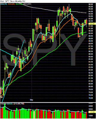
logo

Tuesday, June 30, 2009

Today's Markets

This is really interesting.


Prices moved into the 20 day SMA and bounced lower. However


Prices are using the 20 day EMA for technical support. Interesting....

Case Shiller Drops


Click for a larger image

There is a lot of "excitement" regarding the upward movement of the graph. Notice this is the first upward move in quite sometime. And -- most importantly -- it's only one month. As a result it's important to not get carried away. It's good news, but it is only one data point in a long series of data that move in the other direction. In addition consider this chart:


Click for a larger image.

I encircled the cities that had a 10% or less year over year price decline. Notice there aren't that many of them. That's an important point here. When that number is larger -- say 10 -- then I'll get excited.

Consumer Confidence Drops


From the Bonference Board:


Consumers' appraisal of present-day conditions was less favorable in June. Those claiming business conditions are "good" decreased to 8.0 percent from 8.8 percent, while those saying conditions are "bad" increased to 45.6 percent from 44.5 percent. Consumers’ assessment of the labor market was also less favorable. Those stating jobs are "hard to get" increased to 44.8 percent from 43.9 percent. Those saying jobs are "plentiful" decreased to 4.5 percent from 5.8 percent.

Consumers' short-term outlook also waned in June. Consumers anticipating an improvement in business conditions over the next six months decreased to 21.2 percent from 22.5 percent, while those expecting conditions will worsen increased to 20.2 percent from 18.0 percent in May.

The job outlook was also more pessimistic. Those anticipating more jobs in the months ahead decreased to 17.4 percent from 19.3 percent, while those anticipating fewer jobs increased to 27.3 percent from 25.6 percent. The proportion of consumers expecting an increase in their incomes declined to 9.8 percent from 10.8 percent.

Notice that within the various sub-categories we have a slight movement from positive to negative. But the move is slight (at least so far). If we have another 2-3 months of data then I'll be concerned. But a reading of the data indicates this is a slight shift as opposed to a majov move.

A Closer Look At Personal Consumption Expenditures


Notice the following on the above chart:

1.) PCEs fell out of bed last year -- notice the high month over month and year over year drops.

2.) This year PCEs have returned to more "normal" month over month increases.

3.) The year over year number appears to be bottoming.

This is the same pattern retail sales have displayed. Consumers stopped spending last year and have now returned to the market in a more limited manner.

Treasury Tuesdays

Click on all images for a larger image


The Treasury market continues to rebound. Notice that prices have been rising since roughly mid-June. Also note that prices are above the 10 and 20 day EMA and are just below the 50. Also note the 10 day EMA is about to cross over the 20 day EMA -- another bullish signal. In addition,


The MACD is rising as is


The on balance volume -- indicating more people are moving into this security.

Brown's Bankrupt Britain

Brown's Bankrupt Britain
Revised figures from the Office for National Statistics (what use are stats if they have to be forever revised?) show that the the UK economy shrank by 2.4% in Q1 2009. This is the fastest rate in more than 50 years, and far worse than expected.

In related news Brown has published a "quasi manifesto" outlining his plans for his "relaunch". Unfortunately these plans will come to nothing:

1 They are uncosted, and Brown has not stated how he intends to pay for them.

2 The country is bankrupt.

3 He has been responsible (as Chancellor and latterly as PM) for the country's finances since ZaNulabour were elected in 1997. The fact that we are in this mess now is in no small part down to him.

4 Brown is not the man to rebuild/relaunch Britain, or its bankrupt economy.

5 Public sector pensions now stand at £1.2 Trillion (equivalent to 85% of Britain's GDP), this figure is unsustainable.

Brown has bankrupted Britain, yet now claims that his relaunch will save it.

Who is he trying to kid, us or himself?

Monday, June 29, 2009

Today's Markets


Yes the markets are moving higher. However, notice the lack of volume over the last two days. That's does not bode well for a stronger move higher.


The daily charts shows two interesting points.

1.) Most of the price moves came at the beginning of the session.

2.) There was a heavy volume surge in the last 10 minutes of trading that didn't move the market higher.

An Economic Chicken And Egg Story

I really wish we could all wake up tomorrow (or today which would be better) and see headlines like "the economy is returning to 4% growth and unemployment is at 5%". Unfortunately that is not going to happen. In economics certain things usually happen before other things. To that end, below is a discussion about when jobs will come back.

Let's start with the conclusion of a Fed letter from the San Francisco Federal Reserve:

What does all this mean for the course of the labor market? We combine data on involuntary part-time workers with the standard unemployment rate to arrive at an alternative measure of labor underutilization. We plot this measure in Figure 3, which shows that the labor market has considerably more slack than the official unemployment rate indicates. The figure extends this labor underutilization measure using the Blue Chip consensus forecast for the unemployment rate as a benchmark and then adding a share of involuntary part-time workers based on the proportion of workers in that category to the unemployed during the current recession. This projection indicates that the level of labor market slack would be higher by the end of 2009 than experienced at any other time in the post-World War II period, implying a longer and slower recovery path for the unemployment rate. This suggests that, more than in previous recessions, when the economy rebounds, employers will tap into their existing workforces rather than hire new workers. This could substantially slow the recovery of the outflow rate and put upward pressure on future unemployment rates.


Here's the translation: there are a lot of people out of work and -- just as importantly -- a lot of people who are underutilized. That means that when the economy ramps up there are a ton of people who need work. That means it's going to take awhile for the unemployment rate to come back down.

At this point it makes sense to highlight a current argument about terminology -- what do you call the period between a return to positive GDP growth and the drop in umemployment? Is that really a recovery or another economic period that we need a new name for? Personally, I call it a recovery although I more than understand that others will understandably differ with that analysis. At this point it's a judgment call.

However, let's look at a simple economic fact. GDP has to turn positive in order for unemployment to start dropping. Below are three graphs from the St. Louis Federal Reserve. They show two data points: the yeare over year percentage change in GDP and the unemployment rate. With all recoveries save one (the one after the end of WWII) GDP has bottomed before unemployment started to drop. Notice that in the 1950s the length of time was fairly long. This difference contracted in the 1970s but returned in the 1980s and beyond. However, regardless of the length of time, it's important to note we need positive GDP growth before we start to think about a lowering unemployment.


This is one reason why the leading indicators are so important -- they occur before a recovery starts. And that's why the last two months of very positive news in that arena is so important:

The Conference Board LEI for the U.S. increased sharply for the second consecutive month in May. In addition, the strengths among its components continued to exceed the weaknesses this month. Vendor performance, the interest rate spread, real money supply, stock prices, consumer expectations, and building permits contributed positively to the index, more than offsetting the negative contributions from weekly hours and initial unemployment claims. The index rose 1.2 percent (a 2.4 percent annual rate) between November 2008 and May 2009, the first time the index has increased over a six-month period since July 2007, and the strengths among the leading indicators have become balanced with the weaknesses during this period.


Ideally what happens is the leading indicators increase, GDP turns positive and then unemployment drops. Now -- when unemployment drops is a big issue. But history tells us it drops after GDP turns positive. So, let's hope we see some growth soon.

Are We There Yet? Not Quite.

This was written by Invictus as well.

There's widespread consensus that things are "less bad" of late than they were in the fourth quarter of 2008 or the first quarter of 2009. It's hard to disagree with that. However, when is the recession going to end, and what is going to become of the so-called "green shoots" that have taken the stock market from 666 in mid-March to almost 950 (on the S&P) recently?

Bonddad and I recently did some work advancing the notion that the consumer -- who has been 70 percent of GDP for the past eight years -- is over-levered and in no shape to continue shouldering that burden for the foreseeable future. It's my belief that the recovery, when it comes, is going to be shallow at best, and it's not out of the question that we double-dip (assuming we actually emerge) after miniscule positive growth triggered by replenishment of the massive inventory draw-downs we've seen in the past couple of quarters.

But let's not get ahead of ourselves. When will the recession end? We know that the National Bureau of Economic Research (NBER) will not date the end for quite some time to come.

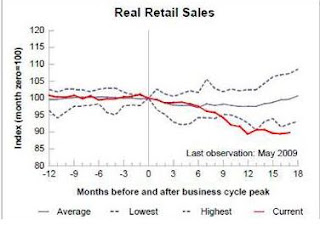
Aside from GDP, we know that the NBER looks at many other measures of our economy's health. Most notably (in what I believe may be their order of importance) are Employment (PAYEMS at St. Louis Fed), Industrial Production (INDPRO at St. Louis Fed), Real Income, and Real Retail Sales.

Here's a look at how those four metrics look of late relative to other recessions (via St. Louis Fed):


We also know -- because he's told us -- that one member of the NBER's Business Cycle Dating Committee, professor Jeffrey Frankel, likes to look at the Aggregate Weekly Hours Index (AWHI), since employers typically cut hours before they cut bodies, and similarly increase hours before they hire bodies.


Here's what that looks like:


It is certainly difficult, if not impossible, to argue that anything has actually troughed as yet. And employment will undoubtedly not pick up until after hours are increased and employers feel that they actually need additional bodies.

Another area that the "green shoots" crowd points to is Unemployment Claims, a high-frequency (weekly) number that has shown signs of stabilization and, arguably, slight improvement.


Even continuing claims -- an important metric that needs to confirm the weekly number -- has recently (last week) improved (by a meaningful -148,000):


Now, don't get me wrong, I'll take what I can get. But pulling back the lens a bit, this is what the improvement looks like from a longer-term view:


Bottom line: While there may be some justification for cautious optimism, the key and operative word must remain "cautious." As to calling the end of the recession -- notwithstanding any positive GDP print we might get over the next quarter or two -- it doesn't seem we're quite there just yet. We will, of course, continue to monitor the available data for signs of a trough. While we will no doubt emerge from recession eventually, attention should be paid to the type of recovery we can muster, and how we're going to re-employ the six million Americans who've lost their jobs over the past eighteen months.

Mr. Market Says He Wants Some Respect

I have invited Invictus to start posting here. He usually posts at Blah3 but I've asked him to start posting some economic and market observations here.

A significant event – perhaps very significant – took place in the market last week, yet it has gone under most of the radar I look at. The S&P500 completed a fairly rare “Golden Cross.” What is a Golden Cross, you ask? Well, Merrill Lynch’s technical analyst, Mary Ann Bartels, did some great work on Golden Crosses. Herewith some of her findings:


Here’s a look at the S&P500 and the Golden Cross:


Now, you can get a Golden Cross under a wide variety of scenarios. As it happens, we got one this week under the best possible circumstances:


Here’s the performance of the S&P500 after a Golden Cross associated with an NBER-declared recession:


As sanguine as I am about the prospects for a robust, sustainable recovery, the facts are the facts, and the track record of the Golden Cross is impressive indeed. There's much more to Bartels' report (and Birinyi did some work on it this week, too), but the point simply needs to be made that this is, from a technical perspective, a rather meaningful event.


Market Mondays

Welcome back. I hope everybody had a good weekend. Let's start by taking a look at the markets.


The SPYs and IWMs have bounced off the 50 day EMA while the QQQQs have bounced from a slightly higher lever. In addition, all three averages have moved through downward sloping trend lines. This should be a good sign technically. However, I am skeptical for the following reaons. First --note that volume totals are not impressive. If prices move through a trend line we want to see some impressive volume to indicate an increase in underlying activity. That hasn't happened here. In addition,


On the latest peak notice the MACDs did not follow suit. That is a technical divergence that is hard to ignore. And then there is the advance decline lines:


Market breadth hasn't been there either.

All of these pieces lead me to question the market's ability to move higher from here with any conviction.

Who's In Charge?

Those of you who were worried about who is exactly is in charge of the UK need worry no more, Lord Mandelson has revealed that he is in charge and the person where the "buck stops".

In an interview with The Today programme he said:

"The spending period currently operating in Government stretches beyond the next election and therefore it is reasonable to review public spending at that time."

Adding that the Chancellor has already "made that judgment".

By making that statement in public, he has tied both the Chancellor's and the Prime Minister's hands.

Now all we need to know is who exactly is in charge of the Tripartite regulatory system; the Bank of England, the FSA or the Treasury?

Friday, June 26, 2009

Weekend Weimer and Beagle

It's that time of the week. See you on Monday


Is This Another Sign of A Market Correction?

Yesterday the IEFs and TLTs made higher moves. Is this money that would be going into the market instead going into bonds because their yield is attractive? Or, are people taking profits off the table and moving into Treasuries awaiting the next move? Click on all images for a larger image -- and ignore the last bar.


CBO Sees Problems Brewing

From the CBO:

Today CBO released the Long-Term Budget Outlook. Under current law, the federal budget is on an unsustainable path—meaning that federal debt will continue to grow much faster than the economy over the long run. Although great uncertainty surrounds long-term fiscal projections, rising costs for health care and the aging of the U.S. population will cause federal spending to increase rapidly under any plausible scenario. Unless tax revenues increase just as rapidly, the rise in spending will produce growing budget deficits and accumulating debt. Large budget deficits would reduce national saving, leading to more borrowing from abroad and less domestic investment, which in turn would depress income growth in the United States.

Keeping deficits and debt from reaching levels that could cause substantial harm to the economy would require increasing revenues significantly as a percentage of gross domestic product (GDP), decreasing projected spending sharply, or some combination of the two. Making such changes sooner rather than later would lessen the risks that current fiscal policy poses to the economy. Although the policy choices that will be necessary are difficult, CBO’s long-term budget projections make clear that doing nothing is not an option: Legislation must ultimately be adopted that raises revenue or reduces spending or both. Moreover, delaying action simply exacerbates the challenge, as is discussed in the report.

I ran some of the current numbers from the CBO's historical data series. Here are the relevant charts (click for a larger image):


Forex Fridays


Overall, the downward trend from the double top continues. Prices are moving lower and the MACD and RSI are confirming the trend. The 10 and 20 week EMA are also moving lower with the 10 week EMA going though the 50 week EMA and the 20 about to follow suit.


The daily chart is a great example of bear market rallies -- it contains two. Notice how prices are moving lower but the lower movement is interrupted by several pennant and flag patterns. These are classic bear market corrections.

FSA Tries To Pull Its Head From The Sand

Our ever "vigilant, pro active and respected" Financial Services Authority (FSA) has attempted to pull its head out of the sand and has proposed that financial advisers should no longer receive commission from selling investments, pensions and insurance products.

Doubtless this will come as welcome news to the millions of hapless endowment policy holders who were mis-sold these useless products in the 80's by commission hungry salesmen!

The FSA said:

"We propose to ban product providers from offering amounts of commission to secure sales from adviser firms and, in turn, to ban adviser firms from recommending products that automatically pay commission."

This being the FSA, even if the rule changes are implemented, they won't come into effect until 2012.

Given that millions of consumers (aside from the endowment holders) were also wrongly advised to opt out of occupational pension schemes, and were conned into buying precipice bonds and split-capital investment trusts, one wonders why it took the FSA so long to pull its head out of the sand and act.

Asleep at the wheel as ever!

Thursday, June 25, 2009

Today's Markets


The big news today was from a technical perspective. Notice that prices moved above 10 day trendlines on all four averages. That's a very important move technically. However, look at the daily charts and you'll notice that prices are rebounding from a downward movement.

The DIAs are rallying into the 200 day SMA

The SPYs are rallying from teh 200 day SMA (a good development) but are rising from the lower point of a downward sloping channel.


The one exception is the QQQQs

Share

Twitter Delicious Facebook Digg Stumbleupon Favorites More